
ברשתר הקומPLEKS של רשתות הרכבת התחתית, החוויה של נסיעה יכולה להיות משימה מפחידה הן עבור תושבים הוותיקים והן עבור מבקרים ראשונים. המנהרות המורכבות, מספר גדול של קווים והפלטפורמות העמוסות יכולות להאיץ במהרה גם את הנוסע הכי חוויל. כאן נכנס לתמונה התפקיד של סימנים שתוכננו היטב. סימני רכבת תחתית יעילים משמשים כאור מדריך, המאפשרים לנוסעים לנווט בצורה חלקה בין השערים, לבצע מעברים ולהגיע לפלטפורמות המבוקשות ללא בלבול או התעכובות לא הכרחיות. בערך זה נחקור את חשיבותם של סימנים חזקים ברשתות הרכבת התחתית, האלמנטים הבסיסיים של עיצוב סימן מושפע, וכיצד העיצובים האלה מטרמים את חווית הנסיעה היומית.
התפקיד החשוב של ברירות בסימני רכבת תחתית
הבהירות היא הפינה הגדולה של כל מערכת חתימות תחת-קרקעית מוצלחת. בסביבה מהירה של תחנת מטרו, שבה כל שנייה חשובה לנוסעים הממהרים להספיק לאוטובוסים שלהם, החתימות צריכות להעביר מידע מידית. טקסט עמום, אייקונים בלתי ברורים או תבניות מסובכות עלולות לגרום למחסור בהתקשרות ולחשיפה לרמות אגוז גדול יותר.
כדי להשיג וידוי, מעצבים משתמשים בקombinציה של שפה פשוטה, טיפוגרפיה חזקה, סמלים מוכרים ברחבי העולם והפרשים לא מתוסכלים. למשל, שימוש בפונטים גדולים ללא קווים מסיימים מבטיח שהטקסט יישאר קריא גם מרחק גדול או בתנאים צפופים. סמלים פשוטים ובאינטואיציה כמו חץ למעלה ליציאות או אייקון רכבת למתקנים מאפשרים לriders להבין במהירות את ההודעה בלי להצטדק עם תמונות מורכבות. כיוונים ברורים וכפיות, כמו 'מפלט 3, רכבות לבroker' כתובים בשפה פשוטה, מסירים כל מקום לפרשנות שגויה, מבטיחים שהנוסעים יוכלו לעבור את המתחם בהבטחה.
עוצמת הקונסיסטנטיות בעיצוב תבליטים
הסיבה היא איבר נוסף שתרם להצלחת לוחות הסימנים במערכת התחתית. כשסימנים מחזיקים במראה אחיד ועוקבים אחר קבוצה אחידה של כללים עיצובייםsthroughout מערכת התחתית, זה יוצר תחושה של מוכרים וקלות bagi נוסעים. זה אומר להשתמש באותיות, סכيمي צבעים, וסטנדרטים בגודל זהים על כל הלוחות, מהמצביעי הפלטפורמה ועד למפות מסלול.
לדוגמה, איפוס צבע שונה לכל קו מטרו והשימוש הקבוע באותו צבע על מפות, לוחות תבליטים בפלטפורמות וצגונים דיגיטליים עוזר לנוסעים לזהות במהירות את הנתיב המבוקש ולעקוב אחריו. אם "הקו הירוק" מיוצג תמיד בצבע ירוק בכל חלק מסיסת התבליטים, נוסעים יכולים להתחבר בקלות בין הצבע לקו, מה שמאפשר מעברים וניווט יותר אינטואיטיביים. עיצוב-consistent גם משתרע למיקום המידע, כך שהנוסעים יודעים לאן להביט לפרטים פרטים ספציפיים, سواء שזוהי זמנים של רכבות, כיווני יציאה או הודעות שירות. אחידות זו מפחיתה את העומס הקוגניטיבי, מה שמאפשר לנוסעים להתמקד בהרפתקה שלהם במקום לפענח תבליטים חדשים או לא-אחתים.
הבטחת נגישותיות עבור כל הנוסעים
נגישות היא היבט בלתי ניתן למשא ומתן של עיצוב של סימנים ברכבת התחתית. מערכות הרכבת התחתית משרתות מגוון רחב של נוסעים, כולל אלה עם לקויות ראייה, שמיעה או תנועה. כדי ליצור סביבה כוללנית, סימנים חייבים להיות מעוצבים כדי להתאים את הצרכים של כולם.
לנוסעים עם לקות ראייה, הוספת טקסט ברייל לצד מידע מודפס מספק אמצעי מגע לגישה לפרטים חיוניים. צירופי צבעים בעלות ניגודיות גבוהה, כמו טקסט שחור על רקע לבן, משפרים את הקוראיות עבור אלו עם לקות ראייה או עיוורון צבעים. תבלונים צריכים גם להיות מוצבים בגובה מתאים, כדי להבטיח שהם בתוך שדה הראייה והגעה של נוסעים המשתמשים בכיסאות גלגלים או כלים אחרים לעזרת התנועה. בנוסף, חיבור הודעות קוליות מתאימות לתבלונים חזותיים עוזר (*((nosae|nusae)))irosi
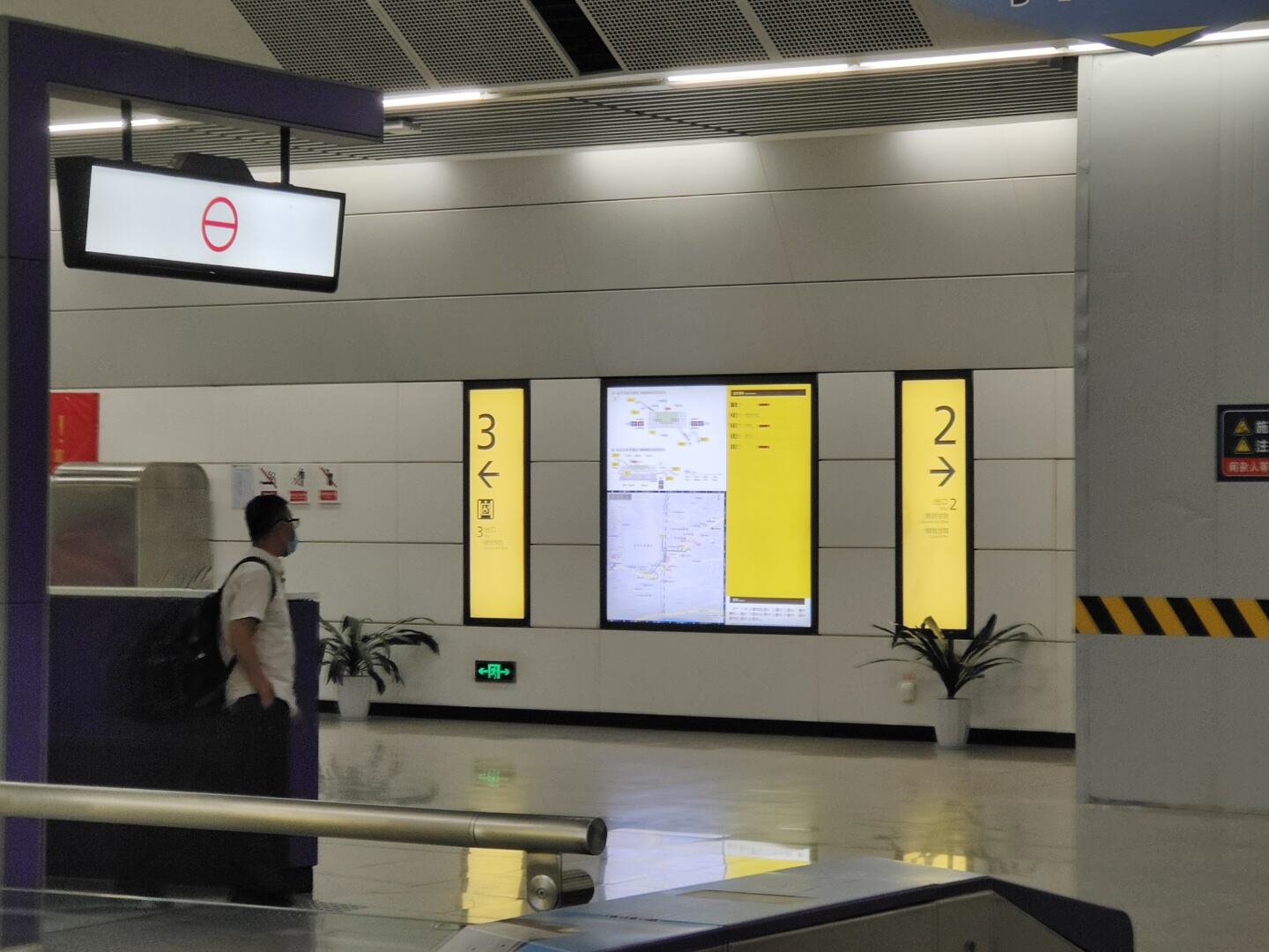
התקדמות טכנולוגית בתחום תבלונות מטרו
מפת הפרסום של תחנות המטרו עוברת שינוי משמעותי עם שילובן של טכנולוגיות חדשות. לוחות תצוגה דיגיטליים וקונטרים עם מסך מגע הפכו לנפוצים יותר בתחנות מטרו, ומספקים מידע בזמן אמת על יעדי רכבות, דחיות והפסקות בשירות. בניגוד לשלטים סטטיים, פלטפורמות דיגיטליות אלו ניתנות לעדכון מיידי, מה שמבטיח שהנוסעים יקבלו את המידע המדויק וה aktualני ביותר.
לדוגמה, במהלך אירוע גדול או הפסקת שירות פתאומית, לוחות דיגיטליים יכולים להציג במהירות נתיבים חלופיים וזמני המתנה משוערים, מה שמאפשר נוסעים לקבל החלטות מושכלות ולעשות תקצירים מתאימים לתכניות הנסיעה שלהם. בהביט קדימה, התגלמותה של טכנולוגיית מציאות מוגברת (AR) מחזיקה במשמעויות גדולות עבור ניווט במטרו. דמיינו נוסעים המנויים משקפי AR שמטילים כיוונים דיגיטליים ומידע על הסביבה הפיזית, מדריכים אותם ישירות אל הפלטפורמות או יציאות שלהם. אפליקציות ניידות גם הן מילאו תפקיד מכריע יותר ויותר, מספקות תכנון נתיבים מותאם אישית, עקיבה בזמן אמת, ואפילו תכונות מיפוי פנימי שמעלות את החוויה הכוללת של הנסיעה.
שיפור רציף באמצעות משוב ומעקב
כדי להבטיח שהסימנים ברכבת התחתית יישארו יעילים לאורך זמן, הערכה ותחזוקה קבועים חיוניים. מנהלי הרכבת התחתית צריכים לחפש פעילות משוב מהנוסעים באמצעות סקרים, תיבות הצעות או פלטפורמות דיגיטליות. ניסוי שימושיות עם קבוצה מגוונת של נוסעים יכול גם לחשוף אזורים שבהם הסימנים עשויים להיות קצרים, כגון כיוונים מבלבלים, שרירים קשים לקריאה או סימנים המוצבים בצורה לא טובה.
על ידי זיהוי נקודות הקשיים הללו, סוכנויות התחבורה יכולות לבצע התאמות ושיפורים בזמן למערכת הסימנים. ככל שהצרכים של הנוסעים ודפוסי הנסיעה מתפתחים, כך גם צריך להיות הסימן. היות ונועדת לשינויים בטכנולוגיה, מגמות עיצוב וציפיות של המשתמשים מאפשרת למערכות הרכבת התחתית לשפר את הסימנים שלהן באופן מתמשך, מה שהופך כל נסיעה למתקדמת יותר, יעילה יותר ופחות מלחיצה עבור כולם.
לסיכום, עיצוב של תוויות יעיל הוא מרכז של חוויה של נסיעה במטרו ללא תפירה. על ידי העדיפות בהירות, עקביות, נגישות, וחיבבת התקדמות טכנולוגית, תוך שמירה על תגובה לדעות, סוכנויות תחבורה יכולות ליצור מערכות סימנים שלא רק להדריך נוסעים דרך הרכבת התחתית אלא גם לשפר את איכות החיים הכללית שלהם. ככל שהאוכלוסייה העירונית ממשיכה לגדול ולהסתמך על תחבורה ציבורית, החשיבות של סימני תחתית מעוצבים היטב רק תהיה יותר בולטת, להבטיח שהתחתית תישאר אמין וידידותי למשתמש אמצעי נסיעה בשנים הבאות.