
ហេតុអ្វីបានជាសញ្ញាណក្នុងអគារត្រូវតែចូលគ្នាជាមួយការតុបតែង៖ ភាពស៊ីសង្វាក់គ្នានៃសោភ័ណ្ឌភាព និងបទពិសោធន៍អ្នកប្រើប្រាស់
យ៉ាងណា សញ្ញាធម្មយុតខាងក្នុង ពង្រឹកអត្តសញ្ញាណកន្លែង ដោយមិនរំខានដល់ភាពស៊ីសង្វាក់គ្នានៃការរចនា
តួនាទីដែលមានប្រយោជន៍របស់ សញ្ញាធម្មយុតខាងក្នុង : ការរកផ្លូវ, ការគោរពតាមបទបញ្ញាត្តិ, និងការប្រាប់រឿងម៉ាក
សញ្ញាក្នុងខាងក្នុងធ្វើអ្វីៗច្រើនជាងគ្រាន់តែមើលទៅស្អាត ពិតប្រាកដណាស់ វាមានតួនាទីសំខាន់ៗក្នុងរបៀបដែលមនុស្សមានបទពិសោធន៍នៅក្នុងទីតាំងផ្សេងៗ។ ឧទាហរណ៍ដូចជាប្រព័ន្ធជំនួយការរកផ្លូវ មន្ទីរពេទ្យដែលបានអនុវត្តផ្លូវដែលប្រើពណ៌ផ្សេងៗគ្នាដើម្បីកំណត់ បានរាយការណ៍ថាការឆ្លើយតបបន្ទាន់ត្រូវបានកាត់បន្ថយប្រហែល 40%។ ប្រសិទ្ធភាពបែបនេះធ្វើឱ្យមានភាពខុសគ្នាពិតប្រាកដក្នុងអំឡុងពេលបន្ទាន់។ សញ្ញាសុវត្ថិភាព និងការគោរពតាមបទបញ្ញាត្តិគឺជាកត្តាមួយទៀតដែលត្រូវការ ពួកវាធានាថាអ្នកទាំងអស់គ្នាដឹងពីទីតាំងច្រកចេញបន្ទាន់ ហើយអាចរកឃើញផ្លូវចូលដែលងាយស្រួលប្រើប្រាស់នៅពេលចាំបាច់។ ប៉ុន្តែក៏មានអ្វីមួយដែលមានលក្ខណៈយុទ្ធសាស្ត្រអំពីអ្វីដែលសញ្ញាបានបញ្ជាក់អំពីអាជីវកម្មផងដែរ។ ការជ្រើសរើសសម្ភារៈ និងរចនាប័ទ្មអក្សរប្រាប់រឿងអំពីអ្នកដែលដំណើរការទីតាំងនោះ។ ក្រុមហ៊ុនបច្ចេកវិទ្យាភាគច្រើននិយមប្រើអក្សរភ្លឺពីក្រោយ ពីព្រោះវាបញ្ជាក់ពីភាពច្នៃប្រឌិត។ ខណៈដែលការិយាល័យច្បាប់និយមជ្រើសរើសអក្សរ serif បែបបុរាណដែលត្រូវបានដាក់នៅលើផ្ទាំងប្រាក់កូប ពីព្រោះវាមើលទៅបុរាណ និងគួរឱ្យទុកចិត្ត។ នៅពេលធ្វើបានត្រឹមត្រូវ សញ្ញាដែលហាក់ដូចជាសាមញ្ញទាំងនេះក្លាយជាឧបករណ៍ម៉ាកយុទ្ធសាស្ត្រដ៏មានឥទ្ធិពល ដែលបញ្ជាក់យ៉ាងស្ងប់ស្ងាត់អំពីអ្វីដែលអង្គការមួយតំណាងឱ្យ នៅពេលមានអន្តរកម្មរាល់ទាំងអស់របស់វាជាមួយអតិថិជន។
សម្ភារៈ ពណ៌ និងអក្សរ: ចំណុចសំខាន់សម្រាប់ភាពរលូន សញ្ញាធម្មយុតខាងក្នុង ការរួមបញ្ចូល
ការផ្គូផ្គងសម្ភារៈបញ្ជាក់ទីតាំង (ដើមឈើ លោហៈ អាគ្រីលីក) ជាមួយនឹងផ្ទៃខាងក្នុង និងផ្ទៃរាបស្មើ
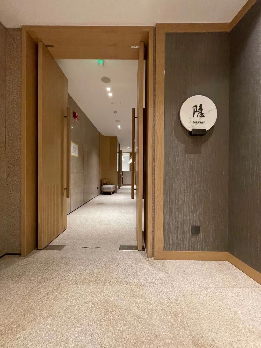
ការជ្រើសរើសសម្ភារៈធ្វើឱ្យសញ្ញាខាងក្នុងតភ្ជាប់ជាមួយផ្ទៃអាគារតាមរបៀបដ៏មានន័យ។ ឈើដំណើរការបានយ៉ាងល្អនៅក្នុងទំហំដែលមានលក្ខណៈធម្មជាតិ ឬបែបធម្មជាតិ ដោយសារគំរូសរសៃធម្មជាតិដ៏ស្រស់ស្អាតទាំងនោះ ហើយលោហៈដែលបានកិនមានរូបរាងសមរម្យនៅក្បែរធាតុបែបឧស្សាហកម្មដូចជាកំបោរ ឬដែក។ អាគ្រីលីកគឺជាជម្រើសដ៏ឆ្លាតវៃសម្រាប់បរិយាកាសទំនើប ពីព្រោះវាអាចរលាយចូលជាមួយជញ្ជាំងកញ្ចក់នៅពេលវាច្បាស់ ឬត្រូវគ្នាជាមួយផ្ទៃដែលបានលាបពណ៌នៅពេលវាមានពណ៌។ ការផ្គូផ្គងផ្ទៃក៏សំខាន់ដែរ។ សញ្ញាបែបម៉ាត់ស្រូបយកពន្លឺដូចជាឈើដើម ខណៈដែលសញ្ញាបែបភ្លឺវិលត្រឡប់ពន្លឺដូចគ្រឿងសង្ហារឹមដែលមានស្រទាប់ថ្នាំលាបភ្លឺ។ ការសិក្សាមួយថ្មីៗពីវិស័យរចនាផ្ទៃបានរកឃើញថា នៅពេលសម្ភារៈត្រូវគ្នាទូទាំងទំហំ មនុស្សអាចរកផ្លូវបានល្អជាងមុន 40% ដោយសារមានភាពច្របូកច្របល់នៃរូបភាពតិចជាងមុន។ ទម្ងន់ និងអាយុកាលក៏សំខាន់ដែរ។ សញ្ញាលោហៈរឹងមាំអាចទប់ទល់បាននៅកន្លែងដែលមានមនុស្សច្រើន និងត្រូវបានប៉ះពាល់ញឹកញាប់ ប៉ុន្តែសញ្ញាអាគ្រីលីកដែលស្រាលជាងនេះគឺល្អឥតខ្ចោះសម្រាប់ការតាំងបង្ហាញបណ្ដោះអាសន្ន ឬគម្រោងខ្លីៗ។ ចុងក្រោយ ការរចនាល្អនឹងបង្កើតអារម្មណ៍រលូន ដែលសញ្ញាមិនមើលទៅដូចជាត្រូវបានភ្ជាប់បន្ថែម ប៉ុន្តែវាចូលគ្នាដោយធម្មជាតិជាមួយរបស់របរផ្សេងៗទៀតក្នុងបរិស្ថាន។
រចនាសណ្ដាប់ពណ៌យុទ្ធសាស្ត្រ និងឋានៈអក្សរសិល្ប៍ដែលគាំទ្រប្រធានបទតុបតែង
ពណ៌ដែលយើងជ្រើសរើសមានឥទ្ធិពលយ៉ាងខ្លាំងដល់ប្រសិទ្ធភាពនៃសញ្ញាបញ្ជាក់ក្នុងអាគារ។ នៅក្នុងមន្ទីរពេទ្យ និងគ្លីនិក ពណ៌ដីក្តៅជួយបង្កើតបរិយាកាសស្ងប់ស្ងាត់ ដែលត្រូវបានគាំទ្រដោយការស្រាវជ្រាវមួយបង្ហាញថា ប្រហែលជា 70% នៃអ្នកជំងឺភ្ជាប់ពណ៌ទាំងនេះជាមួយអារម្មណ៍ស្រួល។ ចំពោះភាពផ្ទុយគ្នា អក្សរពណ៌ធ្យូងងៀតលើផ្ទៃពណ៌ខ្សាច់ភ្លឺគឺល្អសម្រាប់ស្តង់ដារភាពងាយស្រួលប្រើ ហើយក៏មើលទៅស្អាតផងដែរក្នុងលំហទំនើបភាគច្រើន។ អក្សរសាស្ត្រ (Typography) មានសារៈសំខាន់ខ្លាំងសម្រាប់ការរកផ្លូវ។ អក្សរដែលធំ និងដោយគ្មានគ្រាប់ (bold sans serif) ធ្វើឱ្យលេខបន្ទប់ងាយសម្គាល់ ខណៈដែលអក្សរបែបសិល្បៈលម្អសមសម្រាប់សេចក្តីសំឡេងលើជញ្ជាំងដែលបំផុសគំនិត។ គួរប្រើអក្សរប្រភេទតែពីរប៉ុណ្ណោះ ដើម្បីកុំឱ្យរឿងរាល់យ៉ាងមើលទៅច្របូកច្របល់។ ម៉ាកដែលចង់ឱ្យអត្តសញ្ញាណរបស់ខ្លួនចេញមកគួរបញ្ចូលពណ៌ឡូហ្គោទៅក្នុងសញ្ញាបញ្ជាក់ ប៉ុន្តែត្រូវរក្សាឱ្យមានដែនកំណត់។ ការធ្វើឱ្យពណ៌បន្ថែមទាំងនេះមានម្តងហើយម្តងទៀតនៅទូទាំងអាគារ ជួយឱ្យមនុស្សរកផ្លូវបានដោយមិនដឹងខ្លួន ធ្វើឱ្យសញ្ញាដែលមានមុខងារចូលគ្នាជាមួយការរចនាសរុបដោយធម្មជាតិ ដោយគ្មានអ្នកណាដឹងថា ហេតុអ្វីបានជាពួកគេមានអារម្មណ៍ថាដូចនៅផ្ទះ
ពន្លឺ និងរូបរាង៖ ការលើកកម្ពស់ សញ្ញាធម្មយុតខាងក្នុង ជាធាតុរចនាដែលបានគ្រោងទុក
បច្ចេកទេសពន្លឺបរិយាកាស និងពន្លឺបញ្ជាក់ ដើម្បីបញ្ចូលផ្ទាំងសញ្ញាខាងក្នុងទៅក្នុងអារម្មណ៍ និងមុខងារ
ពន្លឺល្អៗធ្វើឱ្យសញ្ញាក្នុងអគារមិនត្រឹមតែជាកន្លែងបង្ហាញទិសដៅប៉ុណ្ណោះទេ ប៉ុន្តែថែមទាំងក្លាយជាធាតុរចនាដែលសំខាន់ផងដែរ។ ពន្លឺបរិយាកាសដូចជាពន្លឺ LED ដែលបានដាក់ជាន់ក្រោមភាពយឺតយ៉ាវ ផ្តល់ពន្លឺស្មើៗគ្នាទូទាំងកន្លែង ដែលអនុញ្ញាតឱ្យមនុស្សធ្វើចលនាបានយ៉ាងងាយស្រួល។ ហើយក៏មានពន្លឺបន្ថែមដូចជាពន្លឺរំភើប ឬផ្ទាំងដែលភ្លើងឆ្លុះពីក្រោយ ដែលធ្វើឱ្យសញ្ញាក្លាយទៅជាផ្នែកមួយនៃសិល្បៈក្នុងបន្ទប់។ ការស្រាវជ្រាវបង្ហាញថា ប្រហែល៧ក្នុងចំណោម១០នាក់មើលឃើញសញ្ញាដែលមានពន្លឺមុនគេនៅពេលយប់ ដែលជួយឱ្យពួកគេធ្វើចលនាបានកាន់តែប្រសើរ។ បូករួមជាមួយការតុបតែងទាំងមូល និងអ្វីដែលកើតឡើង? ម៉ាកផ្សេងៗចាប់ផ្តើមភ្លឺឡើងតាមរយៈការជ្រើសរើសពណ៌ជាក់លាក់។ ឧទាហរណ៍ ប្រដាប់ភ្លើងប្រភេទ 2700K ដែលផ្តល់ពន្លឺក្តៅ ដំណើរការបានល្អនៅកន្លែងដែលមានអារម្មណ៍បែបប្រពៃណី។ លើសពីនេះ ពន្លឺដែលសមស្របធ្វើឱ្យរបស់របរទាំងអស់ងាយមើលឃើញ ដោយគ្មានកន្លែងភ្លឺចាំង។ ហើយកុំភ្លេចថាអាជីវកម្មក៏ទទួលបានផលប្រយោជន៍ដែរ ពីព្រោះកន្លែងដែលមានពន្លឺល្អ អាចប្រើប្រាស់បានយូរជាងនៅពេលយប់។
ប្រើប្រាស់សម្រាប់តុបតែង សញ្ញាធម្មយុតខាងក្នុង រូបភាព - នេអុន អក្សរបីវិមាត្រ សញ្ញាសិល្បៈដែលត្រូវបានដាក់នៅជញ្ជាំង - ជាចំណុចផ្តោតដែលបានរៀបចំ
ស្លាកដែលមិនត្រូវការពន្លឺនៅតែផ្តល់នូវឥទ្ធិពលខ្លាំងតាមរយៈរូបរាង និងទម្រង់របស់វា ហើយសមនឹងរចនាប័ទ្មណាមួយដែលកន្លែងនោះកំពុងមាន។ អក្សរធ្វើពីលោហៈដែលលេចឡើងពីជញ្ជាំងផ្តល់នូវអារម្មណ៍បែបឧស្សាហកម្មចំពោះផ្ទៃខាងក្នុងដែលសាមញ្ញ និងស្អាត។ ស្លាកអាគ្រីលីកដែលកាត់ដោយឡាស៊ែរមើលទៅទំនើប និងរលូនខ្លាំង។ ស្លាកណេអុនគឺពិតជាអស្ចារ្យព្រោះវាដំណើរការបានល្អទាំងពីរយ៉ាង - ភ្លឺកន្លែងនានាក្នុងពេលយប់ ហើយធ្វើជាសិល្បៈក្នុងថ្ងៃ។ នៅពេលដែលត្រូវបានដំឡើងនៅលើជញ្ជាំង ស្លាកដែលធ្វើពីសម្ភារៈធម្មជាតិដូចជាឈើដែលបានកែច្នៃឡើងវិញពីមុននឹងរលាយចូលគ្នាយ៉ាងសមស្របជាមួយការរចនាដែលបានបំផុសគំនិតពីធម្មជាតិ។ ស្លាកទាំងអស់នេះធ្វើអន្តរាគមន៍ដោយចេតនាជាកន្លែងទាក់ទាញការយកចិត្តទុកដាក់ ដែលជួយឱ្យមនុស្សធ្វើចលនានៅក្នុងកន្លែងនានា ដោយមិនរំខានដល់ភាពស៊ីសង្វាក់គ្នានៃរចនាប័ទ្មទាំងមូល។
សកម្មភាពរួមគ្នា: ធានា សញ្ញាធម្មយុតខាងក្នុង ការសមស្របពីគំនិតដើមរហូតដល់ការដំឡើង
នៅពេលដែលអង្គភាពផ្សេងៗគ្នារួមបញ្ចូលគ្នាយ៉ាងជិតស្និទ្ធក្នុងដំណើរការសញ្ញាផ្ទៃក្នុង វាធ្វើឱ្យមានភាពខុសគ្នាដ៏ធំមួយរវាងការដាក់សញ្ញាលើជញ្ជាំង និងការបង្កើតអ្វីមួយដែលពិតជាបំពេញលំហនោះ។ អ្នករចនាសង្គម អ្នករចនា អ្នកផលិត និងអ្នកគ្រប់គ្រងអាគារ ត្រូវតែចូលរួមតាំងពីដំបូង ដើម្បីឱ្យគ្រប់គ្នាយល់ពីរបៀបដែលសញ្ញាទាំងនោះនឹងត្រូវបានដាក់ចូលទៅក្នុងរូបរាង និងមុខងារនៃតំបន់នោះ។ យើងបានឃើញគម្រោងជាច្រើនដែលការទំនាក់ទំនងមិនល្អបាននាំឱ្យមានការកែតម្រូវដែលថ្លៃដើមនៅពេលក្រោយមក។ ឧទាហរណ៍ អ្នកណាម្នាក់អាចជ្រើសរើសសម្ភារៈដែលមិនស៊ីសង្វាក់គ្នាជាមួយអ្វីដែលមានស្រាប់ ហើយបណ្តាលឱ្យមានបញ្ហាក្រោយពេលដំឡើង។ ការប្រើប្រាស់កម្មវិធីគំរូឌីជីថល ជួយឱ្យគ្រប់គ្នាឃើញច្បាស់ថាសញ្ញានឹងដាក់នៅទីតាំងណាក្នុងទំនាក់ទំនងជាមួយគ្រឿងសង្ហារឹម និងពន្លឺ។ ក្រុមខ្លះថែមទាំងបង្កើតគំរូរូបវន្តមុនពេលបញ្ចប់ការសម្រេចចិត្ត។ ការសិក្សាបានបង្ហាញថា វិធីសាកសួរដោយជំហានៗដោយប្រុងប្រយ័ត្ននេះ បានកាត់បន្ថយកំហុសក្នុងការដំឡើងបានប្រហែល 40%។ នៅតាមកន្លែង ការមានអ្នករចនាចូលរួមក្នុងពេលដែលអ្នកទទួលជួលដំឡើង ពិតជាមានសារៈសំខាន់សម្រាប់ការដាក់ទីតាំងឱ្យបានត្រឹមត្រូវ ដោយផ្អែកលើរបៀបដែលមនុស្សធ្វើចរាចរណ៍តាមតំបន់ទាំងនោះ។ សញ្ញាក្លាយជាផ្នែកមួយនៃរឿងរ៉ាវរចនាសរុប ជាជាងការដាក់បន្ថែមនៅទីបញ្ចប់ ដែលមានន័យថាអ្នកទស្សនាអាចស្វែងរកផ្លូវបានល្អជាងមុន ហើយកន្លែងទាំងមូលមានអារម្មណ៍ថាប្រសើរ និងស៊ីសង្វាក់គ្នាជាងមុន។
សំណួរញឹកញាប់
ហេតុអ្វីបានជាការរៀបចំសញ្ញាណខាងក្នុងអោយសមស្របជាមួយនឹងរចនាបែបខាងក្នុងមានសារៈសំខាន់?
ការរៀបចំសញ្ញាណខាងក្នុងអោយសមស្របជាមួយនឹងរចនាបែបខាងក្នុងធានានូវភាពស៊ីសង្វាក់គ្នាខាងផ្នែកសិល្បៈ និងពង្រឹកបទពិសោធន៍អ្នកប្រើប្រាស់ដោយបញ្ចូលគ្នាបានដោយស្រួលទៅក្នុងបរិស្ថាន។
តើសម្ភារៈផ្សេងៗប៉ះពាល់ដល់ការបញ្ចូលគ្នានៃសញ្ញាណយ៉ាងដូចម្តេច?
សម្ភារៈដូចជាឈើ លោហៈ និងអាគ្រីលីក អាចត្រូវគ្នាជាមួយនឹងផ្ទៃបញ្ចប់ខាងក្នុង ដើម្បីបង្កើតរូបរាងដែលសុខដុមគ្នា ដែលពង្រឹកការរកផ្លូវ និងភាពស៊ីសង្វាក់គ្នាក្នុងលំហ។
តើពន្លឺមានតួនាទីអ្វីក្នុងសញ្ញាណខាងក្នុង?
ពន្លឺបំលែងសញ្ញាណខាងក្នុងទៅជាធាតុសិល្បៈ ដោយពង្រឹកការមើលឃើញ អារម្មណ៍ និងការបង្ហាញម៉ាក ជាពិសេសនៅក្នុងបរិយាកាសងងឹត។
ទំព័រ ដើម
- ហេតុអ្វីបានជាសញ្ញាណក្នុងអគារត្រូវតែចូលគ្នាជាមួយការតុបតែង៖ ភាពស៊ីសង្វាក់គ្នានៃសោភ័ណ្ឌភាព និងបទពិសោធន៍អ្នកប្រើប្រាស់
- សម្ភារៈ ពណ៌ និងអក្សរ: ចំណុចសំខាន់សម្រាប់ភាពរលូន សញ្ញាធម្មយុតខាងក្នុង ការរួមបញ្ចូល
- ពន្លឺ និងរូបរាង៖ ការលើកកម្ពស់ សញ្ញាធម្មយុតខាងក្នុង ជាធាតុរចនាដែលបានគ្រោងទុក
- សកម្មភាពរួមគ្នា: ធានា សញ្ញាធម្មយុតខាងក្នុង ការសមស្របពីគំនិតដើមរហូតដល់ការដំឡើង
- សំណួរញឹកញាប់