ဆေးရုံများ သို့မဟုတ် ရုံးအဆောက်အဦများကဲ့သို့သော အထပ်များရှိသည့် အဆောက်အဦများအတွင်းတွင် အတွင်းပိုင်းလမ်းညွှန်တံဆိပ်များသည် လမ်းပြများအဖြစ် တိတ်တဆိတ် လုပ်ဆောင်ပေးပြီး လမ်းလျှောက်သူများ လမ်းကြောင်းရှာဖွေရာတွင် ပိုမိုလွယ်ကူစေရန် အသုံးများသော သင်္ကေတများနှင့် လမ်းညွှန်ချက်များကို အသုံးပြုပါသည်။ လမ်းညွှန်ခြင်းနှင့် ပတ်သက်သော မကြာသေးမီက ထုတ်ဝေခဲ့သည့် သုတေသနအရ လမ်းညွှန်တံဆိပ်များကို ဉာဏ်ရည်မြင့်မားစွာ တပ်ဆင်ထားပါက နေရာကို မရင်းနှီးသော လူများသည် မှားယွင်းသော လမ်းကြောင်းကို ၆၂% အထိ လျော့နည်းစွာ ရွေးချယ်မိကြသည်။ အထပ်တစ်ခုချင်းစီ၏ ကိုယ်ပိုင်အမှတ်တံဆိပ်နှင့် ကိုက်ညီသော အရောင်များဖြင့် မှတ်သားထားသည့် လမ်းကြောင်းများသည် အရေးပေါ်အခြေအနေများတွင် အချက်အလက်များကို အမှန်အကန် ရရှိမှုသည် အသက်များကို ကယ်တင်နိုင်သည့်အတွက် အလိုအလျောက် စိတ်ကူးယဉ် မြေပုံများ ဖန်တီးရာတွင် အကူအညီဖြစ်စေပါသည်။ လတ်တလော လေဆိပ်များ၏ ဖွဲ့စည်းပုံများကို ကြည့်လျှင် အလားတူ ရလဒ်များကို တွေ့ရှိရပါသည်။ လမ်းညွှန်တံဆိပ်များကို လိုက်နာရန် လွယ်ကူပါက ဧည့်သည်များသည် စာသားများဖြင့် ပြည့်နှက်နေသော နံရံများကို ရင်ဆိုင်ရသည့်အခါများနှင့် နှိုင်းယှဉ်ပါက စိုးရိမ်ပူပန်မှုကို ၃၈% လျော့နည်းစွာ ခံစားရကြောင်း အစီရင်ခံကြပါသည်။
လူအများရွေ့လျားနေသည့် အလုပ်များသော ဧရိယာများတွင် ဆုံးဖြတ်ချက်ချရမည့်နေရာမှ ၁၀ မှ ၁၅ ပေခန့် ရှေ့တွင် လမ်းညွှန်ဆိုင်းများ တပ်ဆင်ခြင်းဖြင့် လူများသည် လုံးဝရပ်တန့်စရာမလိုဘဲ ၎င်းတို့၏ လမ်းကြောင်းကို ပြင်ဆင်နိုင်ကြပါသည်။ လမ်းလျှောက်သူများ၏ လှုပ်ရှားမှုဆိုင်ရာ လေ့လာမှုများအရ ၄၅ ဒီဂရီ ထောင့်ဖြင့် ညွှန်ပြထားသော လှံတံများကို အလျားလိုက် တပ်ဆင်ထားသည့် လှံတံများထက် အသိအမှတ်ပြုမှုနှင့် နားလည်မှု ၂၇ ရာခိုင်နှုန်းခန့် ပိုမိုမြန်ဆန်ကြောင်း တွေ့ရှိရပါသည်။ စတိုးဆိုင်များက မိမိတို့၏ ကုန်ပစ္စည်းများကို မြင်သာသော မီးအိမ်ဆိုင်းကြီးများ တပ်ဆင်သည့်အခါ အလုပ်ရှုပ်သည့်အချိန်များတွင် ဝယ်ယူသူများသည် နေရာကို ၁၉ ရာခိုင်နှုန်းခန့် ပိုမိုမြန်ဆန်စွာ ဖြတ်သန်းကြကြောင်း စျေးဝယ်စင်တာများမှ စီမံခန့်ခွဲသူများက သတိပြုမိကြပါသည်။ ထို့အပြင် ပိုမိုမြန်ဆန်စွာ ရွေ့လျားခြင်းသည် လူများသည် ကုန်ပစ္စည်းများကို ကြည့်ရုံသာမဟုတ်ဘဲ ဝယ်ယူမှုများ ပိုမိုလုပ်ဆောင်လာခြင်းကို ဆိုလိုပါသည်။
2023 ခုနှစ်တွင် အလယ်ပိုင်းမြောက်ပိုင်းရှိ ဆေးရုံတစ်ခုသည် ၎င်း၏အတွင်းပိုင်း လမ်းညွှန်အမှတ်အသားစနစ်ကို ထိတွေ့မှုရှိသော မြေပုံများနှင့် မှောင်မိုက်တွင် တောက်ပသည့် ထွက်ပေါက်အမှတ်အသားများ ပေါင်းစပ်၍ ပြန်လည်ဒီဇိုင်းဆွဲခဲ့သည်။ အကောင်အထည်ဖော်ပြီးနောက် စုဆောင်းရရှိသော အချက်အလက်များအရ အချိန်မီမလာရောက်သည့် အစီအစဉ်များ ၄၁% ကျဆင်းခဲ့ပြီး ဧည့်သည်များကို ဝန်ထမ်းများက ပြန်လမ်းညွှန်ပေးရခြင်းမှာ ၃၃% လျော့ကျသွားခဲ့သည်။ မော်ဒျူလာ လမ်းညွှန်အမှတ်အသားစနစ်များက COVID-19 စမ်းသပ်စစ်ဆေးမှုနေရာများကို အချိန်နှင့်တစ်ပြေးညီ အပ်ဒိတ်လုပ်ရန် ခွင့်ပြုပေးခဲ့ပြီး ပြည်သူ့ကျန်းမာရေး အကျပ်အတည်းများအတွင်း အလွန်အရေးကြီးသော အခန်းကဏ္ဍမှ ပါဝင်ခဲ့သည်။
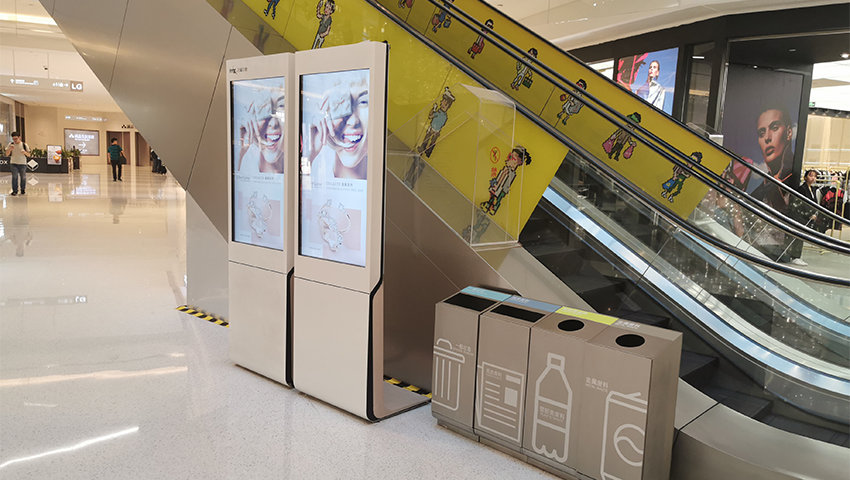
ယခုအခါ LED ဘုတ်များသည် အဆောက်အဦးအတွင်းရှိ စင်ဆာများနှင့် ချိတ်ဆက်၍ လူကျပ်နေသောအချိန်များတွင် အခြားလမ်းကြောင်းများကို ပြသပေးနိုင်သည်။ ဤနည်းပညာကို အသုံးပြုသော စျေးဝယ်စင်တာများတွင် အိတ်ဖွင့်စားသုံးမှု အချိန် ၂၂% ပိုမိုတိုတောင်းသွားခဲ့သည်။ မိုဘိုင်းအပလီကေးရှင်းများနှင့် ချိတ်ဆက်ခြင်းဖြင့် ပုဂ္ဂိုလ်ရေးလမ်းညွှန်မှုများကို ပေးနိုင်ပြီး အပူချိန်မြေပုံ ခွဲခြမ်းစိတ်ဖြာမှုများက လူကူးလူပြောင်းများသော ဧရိယာများကို စီမံခန့်ခွဲသူများ စုံစမ်းစစ်ဆေးရန် နှစ်စဉ် ၄ ကြိမ် အကောင်းဆုံးဖြစ်အောင် ပြုလုပ်နိုင်စေသည်။
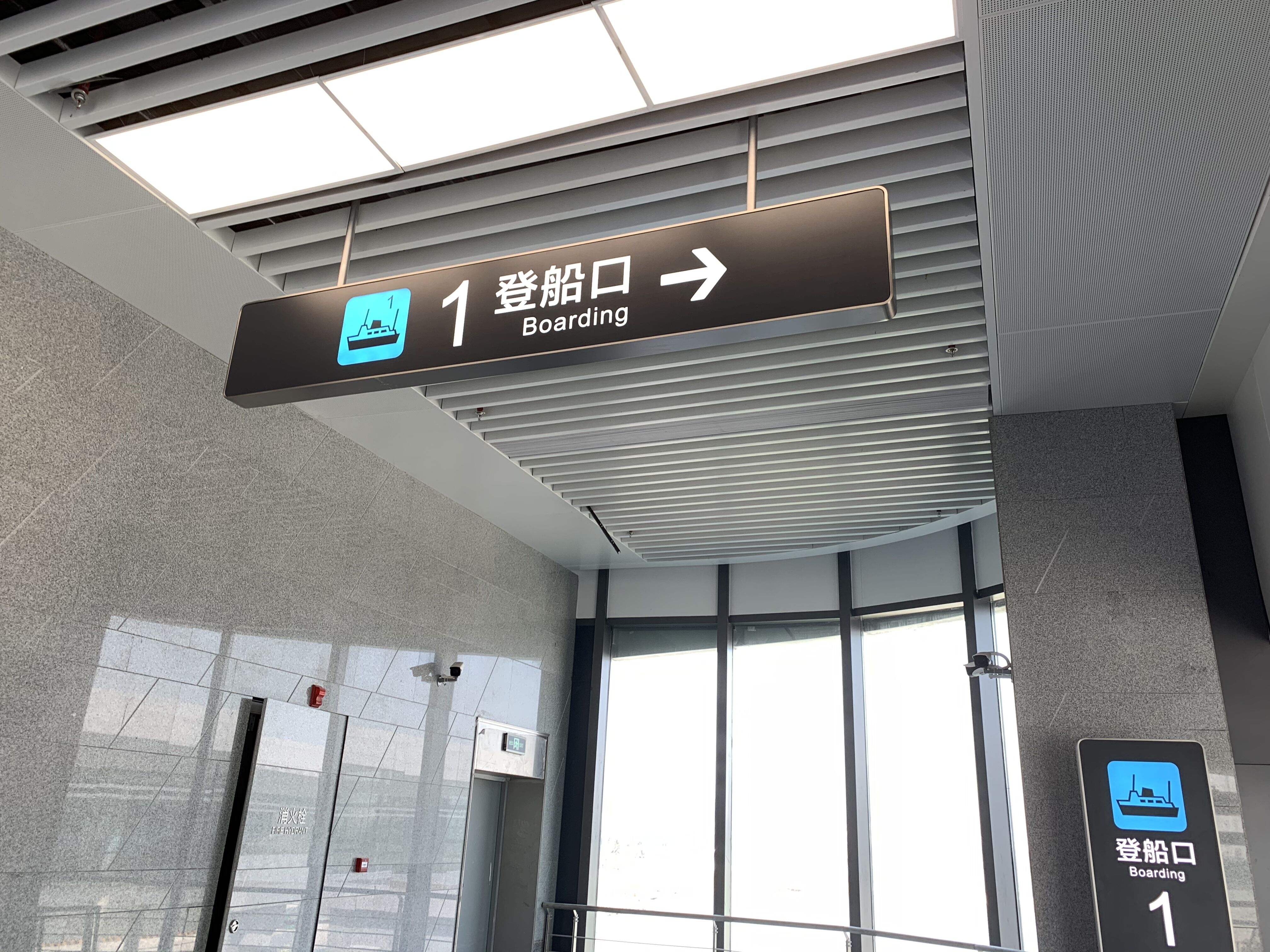
အတွင်းဘက် လမ်းညွှန်အမှတ်အသားများသည် လူများ လမ်းရွေးချယ်ရမည့်နေရာများဖြစ်သော ကုန်းလွှားနား၊ ကော်ရိဒုံးဖြတ်ကျော်ရာနေရာများ သို့မဟုတ် ဓာတ်လှေကားနားတွင် ၁၀ မှ ၁၅ ပေခန့် ရှေ့တွင် တပ်ဆင်ပါက အသက်ရှူသံကဲ့သို့ တိတ်ဆိတ်စွာ လမ်းညွှန်ပေးသည့် ယာဉ်မောင်းထိန်းကဲ့သို့ အလုပ်လုပ်ပါသည်။ ထိုနေရာများတွင် တပ်ဆင်ခြင်းဖြင့် လူများအနေဖြင့် သူတို့သွားရမည့် လမ်းကြောင်းကို ဖတ်ရှုရန် စက္ကန့် ၃ မှ ၅ ခန့် ရရှိမည်ဖြစ်ပြီး နောက်ကျသော အချိန်တွင် လမ်းပြောင်းခြင်း သို့မဟုတ် ပြန်လှည့်သွားရခြင်းများကို လျော့နည်းစေပါသည်။ နေရာများကို လူများ မည်သို့ ရှာဖွေသွားလာကြသည်ကို လေ့လာသည့် လေ့လာမှုများအရ စိတ်ဝင်စားဖွယ် အချက်တစ်ခုကို တွေ့ရှိရပါသည်။ ကြမ်းပြင်မှ လက်မ ၅၄ မှ ၆၆ အကွာအဝေးတွင် မျက်နှာအဆင့်တွင် တပ်ဆင်ထားသော လမ်းညွှန်များသည် ဦးခေါင်းအပေါ်တွင် ချိတ်ဆွဲထားသော လမ်းညွှန်များထက် ပိုမိုမြန်ဆန်စွာ လမ်းရှာဖွေနိုင်စေပါသည်။ သုတေသနများအရ ဤနည်းလမ်းသည် ဦးခေါင်းအပေါ်တွင် ချိတ်ဆွဲထားသော ရိုးရာ လမ်းညွှန်များနှင့် နှိုင်းယှဉ်ပါက လမ်းရှာဖွေမှု အမြန်နှုန်းကို သုံးပုံတစ်ပုံခန့် မြှင့်တင်ပေးနိုင်ကြောင်း ဖော်ပြထားပါသည်။
အဆောက်အဦး ဝင်ပေါက်များ၊ ဟော်လ်မှ ကော်ရိဒုံးသို့ ကူးပြောင်းမှုများနှင့် အစားအသောက်ဈေးနားသို့ ဝင်ရောက်မှုနေရာများကဲ့သို့ လူသွားလမ်းများတွင် လမ်းညွှန်များ၏ မြင်သာမှုကို နှစ်ဆတိုးမြှင့်ရန် လိုအပ်ပါသည်။ အဆင့်ဆင့် ချိန်ညှိထားသော နည်းလမ်းသည် အကောင်းဆုံးဖြစ်ပါသည်။
အဓိကလေဆိပ်ကြီးများသည် တစ်ဆင့်ပြီးတစ်ဆင့် လမ်းညွှန်လက်ဆောင်းအစုအဖွဲ့များကို အသုံးပြုခြင်းဖြင့် ဂိတ်လမ်းကြောင်းလက်လွတ်ဆုံးရှုံးမှုကို ၁၈% လျော့ကျစေခဲ့သည်။ အဆင့်သုံးဆင့်ပါ စနစ်တစ်ခုသည် ခရီးသည်များကို လမ်းညွှန်ပေးသည်-
ဤအဆင့်ဆင့်ခွဲထားသော ချဉ်းကပ်မှုသည် ၂၀၂၃ ခုနှစ် လေကြောင်းလိုင်းအဆောက်အအုံလေ့လာမှုတစ်ခုအရ ခရီးသည်များ၏ စိတ်ဖိစီးမှုကို ၄၁% လျော့ကျစေခဲ့သည်။
ယေဘုယျသင်္ကေတများနှင့် ဦးတည်ရာ မျဉ်းဆွဲများသည် နားလည်ရလွယ်သော ဂေဟစနစ်များ၏ အဓိကအုတ်မြစ်ဖြစ်သည်။ ၂၀၂၂ ခုနှစ် လမ်းညွှန်စနစ်ဆိုင်ရာ လေ့လာမှုတစ်ခုအရ စာသားသာ ပါသော ပိုစတာများနှင့် နှိုင်းယှဉ်ပါက စံသတ်မှတ်ထားသော ပုံဖြင့် ညွှန်ပြမှုများ အသုံးပြုသည့်နေရာများတွင် ဧည့်သည်များ၏ ရပ်တန့်မှုသည် ၃၇% လျော့နည်းကြောင်း တွေ့ရှိခဲ့ရသည်။ ဦးဆောင်ဒီဇိုင်း အဖွဲ့အစည်းများ၏ သုတေသနများက ၃၀-၄၅ ဒီဂရီ ထောင့်တွင် ထားသော မျဉ်းဆွဲများသည် အကြံပြုရာတွင် အကြံပြုဆုံး လမ်းညွှန်မှုကို ပေးကြောင်း အတည်ပြုထားသည်။
ပတ်ဝန်းကျင်ဒီဇိုင်းဆိုင်ရာ သုတေသန (IEDM, 2023) အရ ဦးတည်ရာကို ရှာဖွေရာတွင် အရောင်အသုံးပြုမှုသည် အမြန်နှုန်းကို ၂၈% တိုးတက်စေသည်။ အနီရောင်နောက်ခံတွင် အဖြူရောင်စာသားပါသော အရေးပေါ်ထွက်ပေါက် ပိုစတာများသည် တစ်ရောင်တည်း ပိုစတာများ၏ ၇၆% နှိုင်းယှဉ်ပါက ၉၉% မှတ်မိမှုရှိသည်။ ဒုတိယနေရာများထက် ပို၍ အရေးကြီးသော ဦးတည်ရာများကို ၄၀% ပို၍ ကြီးမားစေခြင်းဖြင့် အဆင့်အလိုက် ပုံစံဖြင့် ဖော်ပြမှုကို ထိန်းသိမ်းပါ။
UK အသုံးပြုနေသည့် 82% ခရီးသွားဆိပ်ကမ်းများတွင် အသုံးပြုထားသည့် FS Albert ကဲ့သို့ ADA စံနှုန်းနှင့်ကိုက်ညီသော ဖောင့်များသည် ၅ မီတာအကွာမှ 20/40 အမြင်အာရုံဖြင့် ဖတ်ရှုနိုင်မှုကို ဖြစ်စေပါသည်။ SpeedPro ဒီဇိုင်းလမ်းညွှန်ချက်များက စာသားနှင့်နောက်ခံအကြား 70:1 ကွာခြားမှု အချိုးကို အကြံပြုထားပြီး မျက်စိအာရုံအားနည်းသည့် အသက်ကြီးသူများအတွက် အလွန်အရေးကြီးပါသည်။ အလင်းရောင်အောက်တွင် ပျောက်ကွယ်သွားတတ်သော အလွန်ပါးသည့် စာလုံးပုံစံများကို ရှောင်ပါ။
၂၀၂၃ ခုနှစ်က စားသုံးသူလေ့လာမှုတစ်ခုအရ ရှုပ်ထွေးသော ပြသမှုများနှင့် နှိုင်းယှဉ်ပါက ရည်ရွယ်ချက်ကို မှတ်မိနိုင်မှုကို မိန်းကလေးဒီဇိုင်းများက 58% အထိ တိုးတက်စေကြောင်း တွေ့ရှိခဲ့ပါသည်။ အောင်မြင်သော အကောင်အထည်ဖော်မှုများတွင် အောက်ပါတို့ကို အသုံးပြုပါသည်-
ဤချဉ်းကပ်မှုသည် ကုမ္ပဏီနှင့် ဧည့်ဝန်ဆောင်မှု ပတ်ဝန်းကျင်များတွင် ဦးနှောက်အပေါ် ဖိအားကို လျော့နည်းစေပြီး အဆောက်အဦ၏ မူလသဘောကို ထိန်းသိမ်းပေးပါသည်။
လုပ်ငန်းများသည် ၎င်းတို့၏ အိုင်ဖီစီးသင်္ကေတ အတွင်းတစ်လျှောက် ပုံစံအထောက်အထားများကို တစ်သမတ်တည်း ထိန်းသိမ်းထားပါက ပရော်ဖက်ရှင်နယ်ဆန်မှုနှင့် အသေးစိတ်ကို ဂရုစိုက်မှုအကြောင်း မက်ဆေ့ချ်တစ်ခုကို ပို့ဆောင်ပေးပါသည်။ လေ့လာမှုများအရ လမ်းညွှန်မှုစနစ်ကောင်းများရှိသော နေရာများကို မရှိသော နေရာများထက် ၂.၃ ဆခန့် ပိုမိုမကြာခဏ အကြံပြုလေ့ရှိကြောင်း တွေ့ရှိရပြီး ဒါဟာ လူများက ဘရန်ဒ်ကို စုစုပေါင်းအတွက် မည်သို့မြင်ကြသည်ကို သေချာစွာ သက်ရောက်မှုရှိပါသည်။ လော့ဘီများရှိ ဒိုင်ရက်တိုရီဘုတ်များနှင့် အခြားလမ်းညွှန်များအကြား စာလုံးပေါင်း၊ အရောင်များနှင့် သင်္ကေတများကို ဆင်တူအောင်ထားခြင်းဖြင့် ဦးနှောက်အတွက် ပိုမိုလွယ်ကူစေပြီး ပိုမိုခိုင်မာသော ဘရန်ဒ်အသိအမှတ်ပြုမှုကို တည်ဆောက်ရာတွင် ကူညီပေးပါသည်။ ဤတစ်သမတ်တည်းဖြစ်မှုသည် ကောင်းမွန်စွာ ပေါ်လွင်ရုံသာမက ဧည့်သည်များကို နေရာများအတွင်း ချောမွေ့စွာ လမ်းညွှန်ပေးရန် အလုပ်လုပ်ပြီး ကုမ္ပဏီများက ပြသလိုသော ပရော်ဖက်ရှင်နယ်ပုံရိပ်ကို ထိန်းသိမ်းရာတွင် အထောက်အကူဖြစ်စေပါသည်။
ဝင်ပေါက်များမှ ၁၅ ပေအတွင်း အဓိကဒိုင်ရက်ထောရီဆိုင်းများကို သဘာဝအမြင်လမ်းကြောင်းနှင့်ကိုက်ညီစွာ တပ်ဆင်ခြင်းဖြင့် အသုံးပြုသူအားလုံးအတွက် မြင်သာမှုရှိစေပြီး အလုံးစုံသော အသုံးပြုသူများအတွက် ၅၅" မှ ၆၀" အမြင့်တွင် ကော်ရီဒိုအမှတ်အသားများ တပ်ဆင်ခြင်းဖြင့် မြင်သာမှုကို သေချာစေပါသည်။ အဓိကဆုံရာနေရာများ (လီဗ်ယေတာဘဏ္ဍာ၊ လမ်းလျှောက်လမ်းများ) မတိုင်မီ ခွဲထွက်သော ဒိုင်ရက်ထောရီများသည် ဧည့်သည် ၆၈% ၏ အဓိကစိတ်ပျက်စရာဖြစ်သည့် ပြန်လှည့်သွားရခြင်းကို ကာကွယ်ပေးပါသည်။
မကြ давန်းစီမံခန့်ခွဲမှုဆိုင်ရာ လေ့လာမှုများအရ ဧည့်သည်များ၏ အတွေ့အကြုံများတွင် ၅၄% သည် လမ်းညွှန်စနစ်ဆိုးရွားမှုမှ ဆင်းသက်လာကြောင်း ဖော်ပြထားပါသည်။ စာသားနှင့်နောက်ခံအကြား ၄၀% ထက်ပိုသော အလင်းအမှောင်ကွာဟမှုရှိသည့် အရောင်ကွာခြားမှုမြင့်မားသော လမ်းညွှန်ပြားများသည် ပထမအကြိမ် လမ်းရှာဖွေမှုအောင်မြင်မှုကို ၈၉% ပိုမိုကောင်းမွန်စေပါသည်။
ရှေ့ဆက်တွေးခေါ်သော အဆောက်အဦများသည် ယခုအခါ အောက်ပါတို့ကို အသုံးပြုနေပါသည်
ရှုပ်ထွေးသော အတွင်းပိုင်းနေရာများတွင် လူများ လွယ်ကူစွာ လမ်းညွှန်ရာတွင် အတွင်းပိုင်း လမ်းညွှန်ဆိုင်းဘုတ်များသည် အရေးပါသော အခန်းကဏ္ဍမှ ပါဝင်ပါသည်၊ အမှားလမ်းလွဲမှုကို ၆၂% လျော့နည်းစေပြီး စိတ်ဖိစီးမှုကို ၃၈% လျော့နည်းစေပါသည်။
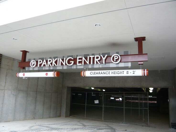
ဆုံးဖြတ်ချက်ချရမည့် အမှတ်များမှ ၁၀ မှ ၁၅ ပေ အရှေ့တွင် တပ်ဆင်ထားသော လမ်းညွှန်ဆိုင်းဘုတ်များသည် လူများအား သူတို့၏ လမ်းကြောင်းများကို ချောမွေ့စွာ ပြင်ဆင်နိုင်စေပြီး လုံးဝရပ်တန့်မှုကို ကာကွယ်ပေးကာ ခြေလျင်လမ်းကြောင်း စီးဆင်းမှုကို ပိုမိုကောင်းမွန်စေပါသည်။
ပေါ်ပေါက်လာသော အချက်များတွင် အဆောက်အဦး ဆင်ဆာများနှင့် အချိန်နှင့်တစ်ပြေးညီ လမ်းညွှန်မှုနှင့် မိုဘိုင်းအပလီကေးရှင်းများမှတစ်ဆင့် ပုဂ္ဂလိကပြုလုပ်မှုအတွက် ဒစ်ဂျစ်တယ် အတွင်းပိုင်း လမ်းညွှန်ဆိုင်းဘုတ်များ ပါဝင်ပါသည်။
တသမတ်တည်းသော ဆိုင်းဘုတ်ဒီဇိုင်းသည် အမှတ်တံဆိပ် ယုံကြည်မှုကို တည်ဆောက်ပေးပြီး အသုံးပြုသူ၏ ယုံကြည်မှုကို မြှင့်တင်ပေးကာ အကြံပြုမှုနှုန်းကို ၂.၃ ဆ ပိုမိုမြင့်တက်စေပါသည်။ ၎င်းသည် ချောမွေ့သော လမ်းညွှန်မှုနှင့် ပရော်ဖက်ရှင်နယ် ပုံရိပ်ကို သေချာစေပါသည်။
 အရေးကြီးသော သတင်းများ
2025-03-06
2025-03-06
2025-03-06
လိုင်စင် © 2025 ရန်ကုန်မြို့ SHENZHEN ZIGO SIGNAGE COMPANY LIMITED မှ လုံခြုံရေးမူဝါဒ