
Mga Pangunahing Prinsipyo ng Typography para sa Disenyo ng signboard
Pagbabasa vs. Kakikilanlan: Paano Hinuhubog ng Distansiya ng Paningin at Kapaligiran ang Pagpili ng Font
Ang magandang disenyo ng palatandaan ay nakadepende sa pagkakaalam ng pagkakaiba sa pagitan ng 'readability' at 'legibility'. Ang 'readability' ay tumutukoy kung gaano kadali intindihin ang sinasabi ng teksto, samantalang ang 'legibility' ay tumutukoy kung gaano kaliwanag ang bawat letra nang paisa-isa. Ang pinakamahalaga ay ang distansya kung saan titingnan ng mga tao ang palatandaan. Halimbawa, ang mga palatandaan sa kalsada ay nangangailangan ng malaki at makapal na mga titik na may sapat na espasyo sa pagitan ng bawat letra, tulad ng DIN, upang makita ito ng mga drayber mula sa mahigit 500 talampakan ang layo. Ngunit kapag gumagawa ng mga palatandaan para sa lobby ng gusali, mas payagan ang mas magandang serif na mga font dahil basahin ito ng mga tao nang malapitan. Ang panahon at kondisyon ng ilaw ay nakakaapekto rin sa mga desisyong ito. Ang isang palatandaan na maganda sa loob ng bahay ay maaaring hindi mabasa sa labas dahil sa matinding liwanag ng araw o malakas na ulan.
- Ang mga backlit LED na palatandaan ay mas mainam gamit ang geometric sans-serif tulad ng Futura, dahil ang kanilang malinis na hugis ay nakakalaban sa pagkakadistract sa ilalim ng sinag
- Ang paghahanap ng landas sa labas ay nakikinabang sa mga font na may mataas na x-height tulad ng Helvetica, na nananatiling madaling basahin anuman ang panahon o pagbabago sa liwanag
- Madalas gumamit ang arkitektural na palatandaan ng mga titik na may mababang kontrast upang mapababa ang halation sa diretsahang sikat ng araw
Nagpapakita ang pananaliksik na ang typograph na hindi naaayon sa distansya ng paningin ay nagpapababa ng pag-alala sa mensahe ng 68% sa layong 100 talampakan, na nagpapakita ng kahalagahan ng pagpili ng font batay sa konteksto
Kontrast, Kulay, at Likuran: Mga Mahahalagang Kadahilanan na Higit na Mahalaga Kaysa Pagpili Lamang ng Font
Kahit ang pinakamadaling basahing font ay nabigo nang walang tamang kontrast. Halimbawa, ang itim-sa-kuning ay nakakamit ng 80% mas mabilis na pagkilala kaysa asul-sa-itim. Kasama sa mga pangunahing isinusulong ang mga sumusunod:
| Factor | Solusyong May Mataas na Epekto | Karaniwang Kamalian |
|---|---|---|
| Kontrast ng kulay | Mga pares na magaan-madilim (≥70% ratio) | Mga komplementaryong kulay |
| Tekstura ng Likuran | Matte finishes sa ibabaw ng metal/piedra | Makinang na sumasalamin na mga ibabaw |
| Balanseng Uri-Timbang | Makapal na mga font sa mga kumplikadong tekstura | Manipis na mga guhit sa mga disenyo |
Mahalaga ang ilaw mula sa kapaligiran: ang puti-sa-madilim ay nagpapahusay ng visibility sa mga natatabingan, samantalang ang madilim-sa-puti ay mas epektibo sa direktang araw. Ayon sa mga pag-aaral, ang perpektong kontrast ay nagpapabilis ng pang-unawa ng 40%, anuman ang uri ng font—na nagpapatunay na ang kontrast ay mas mahalaga kaysa disenyo ng titik.
Nangungunang Sans-Serif na Fonts para sa Mataas na Pagganap Disenyo ng signboard
Bakit Excel ang Helvetica, Futura, at DIN sa Disenyo ng Panlabas at Arkitekturang Signboard
Kapag dating sa mga palatandaan sa mga gusali at mga lugar sa labas, ang Helvetica, Futura, at DIN ang mga pangunahing tatlo dahil lubos silang epektibo sa tunay na kalagayan. Ang Helvetica ay medyo neutral ang itsura, kaya naman malawak itong ginagamit mula sa mga abalang paliparan hanggang sa mga opisina. Kailangan ng mga tao na mabilis makabasa doon nang walang labis na pagkalito o pagkabigo sa paningin. Mayroon namang Futura na may malinis na mga linya at hugis na nagpapahiwatig ng malinaw na pagkakaiba ng bawat titik, kahit pa malayo ang punto ng pagtingin. Mainam din ito kapag ang ilaw sa likod ng palatandaan o masamang panahon ay maaaring magdulot ng hirap sa pagbasa. At huwag kalimutang banggitin ang DIN, na likha ng isang grupo ng mga tagapag-standards sa Alemanya kung ako ay tama sa aking alaala. Ang mahalaga ay ang pantay-pantay na espasyo sa pagitan ng mga titik, na siya ring nagpapadali sa paggawa ng mga ganitong uri ng titik na may lalim para sa mga nag-i-install nito.
Ang mga font na ito na walang serif ay mas mahusay kumpara sa mga may serif sa mahihirap na kondisyon, at binabawasan ang pagkakamali sa pagbasa nang hanggang 40% sa dimlit batay sa mga pag-aaral sa kaliwanagan ng palatandaan. Ang kanilang pagtutol sa pagkakaiba ng kapaligiran ay nagiging mahalaga para sa mga sistemang pangdireksyon na kritikal sa kaligtasan.
Pagkakasya at Kaliwanagan: Pag-uugali ng Font sa mga Titik na May Sukat, LED na Palatandaan, at mga Sistema ng Wayfinding
Mahalaga ang kakayahang umangkop sa iba't ibang teknik ng paggawa. Kapag gumagawa ng malalaking titik na aluminyo, mas mainam ang mga sans-serif na font tulad ng Helvetica dahil ang kanilang malinis na linya ay hindi madaling "mabuhos" o mabago sa proseso ng CNC routing. Kung titingnan ang mga LED display, ang mga bukas na espasyo sa loob ng mga titik ng font na Futura ay nakatutulong upang pigilan ang pagbubukal ng liwanag sa pagitan ng mga titik, kaya nananatiling malinaw ang mensahe kahit mula sa layong mahigit 200 talampakan. Naging pangunahing napili ang pamilya ng font na DIN para sa mga sistema ng paghahanap ng daan dahil sa kanilang pamantayang hugis ng mga karakter na mabilis maipagtapat ng mga tao. Sinusuportahan ito ng mga pag-aaral mula sa Wayfinding Institute na nagpapakita na mas mabilis—humigit-kumulang 87 porsiyento—ang pagkilala ng mga tao sa karaniwang mga palatandaan na ginagamitan ng DIN kumpara sa mga nakakagulat o dekoratibong font. Ito ang siyang nagiging napakahalaga sa mga emerhensiyang sitwasyon kung saan ang mabilis na pagkilala ay maaaring literal na magligtas ng buhay.
Kahit saan gamitin—sa mga palatandaan ng monumento o sa mas maikling menu board—ang mga font na ito ay umaangkop nang hindi nasasakripisyo ang kaliwanagan. Ang kanilang pagganap ay nagmumula sa mga prinsipyo ng disenyo na nakabatay sa ekonomiya ng visual, na nagtatalaga ng prayoridad sa tungkulin kaysa sa dekorasyon.
Mapanuring Paggamit ng Serif at Display Fonts sa Disenyo ng signboard
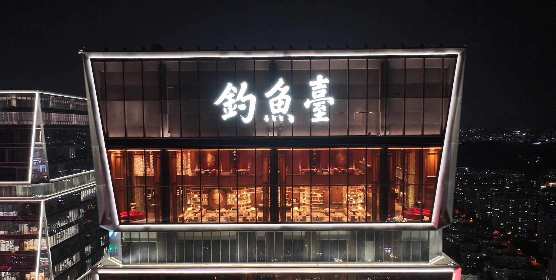
Serif Fonts para sa Awtoridad at Tradisyon: Mga Aplikasyon sa Plake, Senyas sa Lobby, at Pagmemerkado Batay sa Kasaysayan
Ang mga serif font tulad ng Garamond at Times New Roman ay nagpapahiwatig ng awtoridad at tradisyon, kaya mainam ang gamit nito para sa mga plakard ng pag-alala, senyas sa lobby ng mga opisyales, at branding na batay sa pamana. Ang mga huling palapal na tinta sa bawat titik ay nagpapaalala ng kasaysayang patuloy at tiwala—na mahalaga sa mga institusyon na nagnanais ipakita ang katatagan.
Kapag ginamit nang higit sa 10 talampakan, dagdagan ang taas ng titik ng 1 pulgada bawat 10 talampakan upang mapanatili ang kaliwanagan. Ang maingat na pagkakainterval ng mga titik (kerning) ay nag-iwas sa pagkakapiit-piit sa mga titik na inukit sa tanso o may dimensyon, upang mapanatili ang elegansya nang hindi isinasakripisyo ang kalinawan. Ang maingat na pamamaraang ito ay nagagarantiya na ang tradisyonal na estetika ay sumusuporta, imbes na hadlangan, sa paghahatid ng mensahe.
Ipakita ang mga Font na may Layunin: Pagbabalanse sa Pagkakaiba-iba at Kakikiran sa Branded Disenyo ng signboard
Ang display at script na mga font—tulad ng Pacifico—ay nagdaragdag ng pagkakakilanlan sa brand ngunit nangangailangan ng estratehikong pagpipigil. Gamitin ang mga ito nang may pag-iingat, limitado sa 1–3 salita tulad ng logo o tagline sa mga storefront. I-pair ang mga nakalulumba na script sa mga minimalist na background upang mapataas ang kontrast. Iwasan ang manipis na guhit sa mga iluminadong palatandaan, kung saan maaaring mag-diffuse ang liwanag at magpahalumigmig sa pagkakakilanlan ng karakter.
Para sa mga aplikasyon na may dimensyon, pumili ng mga display na font na idinisenyo upang mapanatili ang istrukturang integridad sa sukat na arkitektural. Ang maingat na pagpapatupad ay nagpapanatili ng pagkakakilanlan ng brand habang tinitiyak na ang mahahalagang impormasyon ay agad na nababasa sa layuning distansya.
Pagsusunod ng Pagpili ng Font sa Uri ng Signboard at Konteksto ng Instalasyon
Epektibo disenyo ng signboard isinasama ang typography sa pisikal at pangkapaligirang mga limitasyon. Ang distansya ng panonood ang nagtatakda sa minimum na taas ng letra: ang pamantayan ng 1 pulgada na taas bawat 10 talampakan na distansya ng panonood ay tinitiyak ang batayang kakikiran. Ang mga salik na pangkapaligiran ay karagdagang nagpapayabong sa pagpili:
| Factor | Mga Titik na May Sukat | Mga Nagliliyab na Palatandaan | Mga Sistema ng Pagtuturo sa Daan |
|---|---|---|---|
| Distansya ng Pagtingin | 50–200 talampakan | 100–500 talampakan | 10–30 talampakan |
| Min. Taas ng Titik | 8–12 pulgada | 12–24 pulgada | 1–3 pulgada |
| Mahalagang Tampok | Timbang ng Kuha | Pananakit ng liwanag | Ratio ng Kontrasto |
Kailangan ng mga dimensional na titik ang malalakas, mabibigat na font tulad ng Futura Bold upang mapanatili ang pagkilala sa silweta mula sa kalayuan. Nakikinabang ang mga ilaw na palatandaan mula sa mas simple at bukas na mga glyph na nagpapakintab ng pananakit ng liwanag sa mga titik na nasa loob ng kanal. Ang mga sistema ng ADA-compliant na wayfinding ay umaasa sa mataas na kontrast na sans-serif tulad ng Helvetica, na nakabitin sa antas ng mata para sa madaling pag-access.
Ang mga materyales na pinipili natin ay talagang nagbibigay ng hugis kung paano dinisenyo ang mga bagay. Halimbawa, ang mga palatandaan na nakalagay sa mga baybay-dagat ay dapat gumamit ng materyales na lumalaban sa pagkakaluma, na nakakaapekto sa lalim ng mga ukit na maaaring gawin. Sa loob ng mga abalang gusali, mahalaga ang mga laminadong lumalaban sa gasgas dahil araw-araw ay nababanggaan ang mga ibabaw, na nagbabago sa kanilang itsura sa paglipas ng panahon. Mahalaga rin ang pagsusuri kung paano lumilitaw ang mga palatandaan sa ilalim ng aktwal na kondisyon ng liwanag. Ayon sa pag-aaral ng Transportation Safety Journal noong nakaraang taon, ang sinag ng araw ay maaaring bawasan ng mga 40% ang epektibidad ng retroreplektibong mga palatandaan kumpara sa mga nasa anino. Sa pagpili ng mga font, hindi lamang mga magagandang titik ang pinipili ng mga tagadisenyo kundi mga desisyon na batay sa parehong tungkulin at hitsura, dahil ang mukhang maganda ay hindi laging malinaw basahin sa iba't ibang kapaligiran.
Seksyon ng FAQ
- Ano ang pagkakaiba ng pagbabasa at kaliwanagan sa disenyo ng mga palatandaan?
Ang pagkabasa ay tumutukoy sa kadalian ng pag-unawa sa teksto, habang ang kaliwanagan ay tungkol sa kalinawan ng bawat letra. Mahahalagang salik ito sa disenyo ng mga karatula, na maapektuhan ng distansya ng panonood at mga kondisyon sa kapaligiran.
- Paano nakaaapekto ang kontrast sa disenyo ng karatula?
Mahalaga ang kontrast para sa epektibong disenyo ng karatula. Ang tamang magkasalungat na kulay ay nagpapahusay ng kakikitaan at nagpapabilis sa pagkilala, kung minsan pa nga nang higit sa mismong uri ng titik.
- Bakit kadalasang ginagamit ang mga font na walang serif sa panlabas na palatandaan?
Ang mga font na walang serif tulad ng Helvetica, Futura, at DIN ay mahusay sa panlabas na palatandaan dahil sa kanilang pagtutol sa mga distortiyon mula sa kapaligiran at malinaw na kakikitaan sa iba't ibang kalagayan.
- Kailan dapat gamitin ang mga font na may serif sa disenyo ng karatula?
Ang mga font na may serif ay nagpapahayag ng awtoridad at tradisyon, kaya mainam ito para sa mga plaketa at branding na may kinalaman sa kultura. Angkop ito kapag nais iparating ang katatagan at pangmatagalang kasaysayan.
- Paano dapat isabay ang pagpili ng font sa uri ng karatula at konteksto ng pag-install?
Dapat isaalang-alang ang layo ng paningin, mga salik sa kapaligiran, at konteksto ng pag-install sa pagpili ng font upang matiyak ang epektibo at naa-access na disenyo.