
Understanding Signage Wayfinding as a Communication System
How signage supports intuitive user navigation
Good signage for wayfinding works like an ongoing conversation between the environment and those moving through it. Signs placed at spots where people tend to stop naturally, like when they reach a hallway corner or enter a lobby area, help reduce mental strain and the need to remember directions. Most folks just follow what they see when navigating somewhere new. About 78 percent do this according to Pew Research from 2021, which makes sense since our brains prefer processing visual information over trying to recall complicated instructions.
Mental mapping and aligning signs with cognitive processes
People build spatial awareness through landmark recognition and repeated paths. Strategic sign placement reinforces these mental maps by matching natural attention patterns—like positioning elevator directions where users look upward upon entry. When signage aligns with cognitive processing, navigation speed improves by 33% compared to haphazard placement.
The impact of poor signage on user experience and efficiency
Ineffective wayfinding systems cost organizations an average of $740k annually in lost productivity, with 68% of visitors reporting increased stress in poorly signed spaces (Ponemon Institute 2023). In healthcare settings, unclear signage contributes to 22% longer patient check-in times, highlighting the direct operational consequences.
Signage as a tool for environmental communication
Beyond navigation, signage conveys safety protocols and brand identity through standardized symbols such as emergency exits or sustainability certifications. Facilities using a consistent visual language report 62% higher user confidence scores, demonstrating how cohesive design strengthens both spatial orientation and institutional trust.
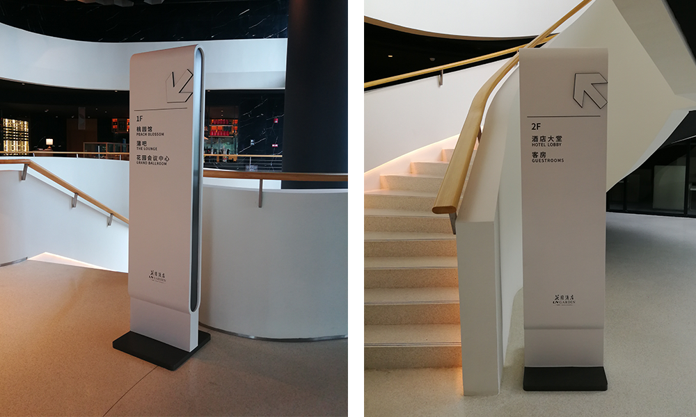
Core Design Principles for Effective Signage Wayfinding
Visibility and Legibility at Critical Decision Points
Signage must be clearly visible at decision-making locations—stairwells, corridors, and service hubs—where users choose their path. Research indicates 89% of users miss critical directions when signs are obstructed or placed outside eye level (Legibility Research Group, 2022), underscoring the importance of unimpeded sightlines.
Readability Through Font, Contrast, and Size Optimization
High-contrast combinations like black-on-yellow or white-on-navy improve text recognition by 62% in low light. Sans-serif fonts such as Helvetica ensure clarity at distances over 15 feet, while character size should follow the 1-inch-per-10-feet rule to maintain legibility across viewing ranges.
Simplicity in Messaging to Reduce Cognitive Load
Signs with seven words or fewer and ISO 7001-compliant pictograms reduce misinterpretation by 38%. A 2023 Airport Navigation Study found that concise phrases like “Baggage Claim —” led to faster user movement than detailed instructions, proving that simplicity enhances efficiency.
Consistency in Design and Visual Hierarchy Across Environments
Standardized color coding—blue for amenities, green for exits—and uniform layouts create predictable patterns. Healthcare facilities using consistent sign templates across departments reduced late patient arrivals by 27%, illustrating how visual continuity supports reliable navigation.
Color Coding and Directional Cues to Guide Attention
Color zones help users move through complex spaces 40% faster than text-only systems. In retail environments, floor-level yellow directional bands increased tenant discovery rates by 33% compared to overhead signage alone, showing the power of integrated visual guidance.
Strategic Placement and Integration with User Behavior
Mapping Decision Points for Optimal Sign Placement
Successful wayfinding depends on identifying high-impact decision areas—junctions, stairwells, entrances—where users need immediate clarity. Studies show 67% of visitors hesitate at these points (2025 Wayfinding Trends Report), making them essential zones for sign deployment. Hospitals prioritize signage near elevators; airports focus on baggage claim visibility.
Aligning Signage with Natural Pathways and Traffic Flow
Signs are most effective when they follow organic movement patterns. Retail environments that align overhead signage with main shopping aisles reduce customer backtracking by 41%, leveraging intuitive flow instead of disrupting it.
Avoiding Visual Clutter Through Strategic Clustering
Scattering redundant signs causes confusion. Best practices recommend grouping two to three related messages at key junctures rather than spacing single signs throughout a corridor. Transit hubs that consolidate schedules, maps, and exit directions near platforms reduce passenger navigation time by 12 seconds per decision.
Integrating Landmarks and Architectural Cues into Wayfinding Design
Architectural features like atriums, sculptures, or unique color schemes enhance orientation when paired with signage. An airport study showed that combining terminal-specific wall colors with directional signs improved first-time visitor accuracy by 28%, confirming the value of blending environmental cues with visual guidance.
Inclusive and Accessible Signage for All Users
ADA Compliance and Universal Design Principles
Getting around buildings shouldn't be a challenge for anyone, which makes accessibility really important for good wayfinding systems. About a quarter of American adults have some kind of disability according to CDC data from 2023, so building signs need to work for people with all sorts of different needs. The ADA standards from 2010 set specific requirements like minimum letter sizes for room signs (think at least 5/8 inch tall letters) and surfaces that don't cause glare problems. These rules aren't just for US buildings anymore either; many top institutions worldwide have started following them too. When facilities actually put these guidelines into practice, they see something pretty remarkable happen: people who struggle with vision issues or mobility challenges make way fewer mistakes finding their way around buildings. Studies show error rates drop by about three quarters when proper accessible signage is installed.
Incorporating Braille, Tactile Elements, and High-Contrast Visuals
Multisensory design ensures inclusivity:
- Raised characters with Braille support tactile reading
- High-contrast combinations (e.g., white on dark blue) aid low-vision users
- Matte finishes minimize glare, especially in sunlit areas
Venues combining tactile and high-contrast elements report 68% faster emergency evacuations than those relying on text-only systems.
Optimal Placement for Wheelchair Users and Visual Impairments
Accessibility also depends on precise placement:
| Placement Factor | ADA Guideline | User Impact |
|---|---|---|
| Vertical mounting height | 48"-60" from floor | Ensures clear visibility |
| Horizontal proximity | Within 24" of doorways | Facilitates tactile access |
| Info repetition | Every 200 ft in corridors | Prevents disorientation |
Centering signs at 54" above the floor—aligned with wheelchair eye level—and maintaining a 70:1 luminance contrast enables equitable access without sacrificing design quality.
Tools and Anchors: Maps, Directories, and Digital Integration
Simplified Maps and Directories as Navigational Anchors
Static maps and directories remain vital components of wayfinding, offering spatial overviews that reduce cognitive strain. Hospitals and airports using simplified floor plans improve navigation accuracy by 34% (Wayfinding Institute 2023). Effective designs use minimal text, clear icons, and color-coded zones that reflect physical architecture.
Digital Signage and Interactive Kiosks in Modern Wayfinding
Interactive kiosks these days are pretty good at figuring out routes on the fly and adjusting when things change in big places such as shopping centers and transportation hubs. The latest report from Wayfinding Tech in 2024 shows most people actually want to use those touch screens rather than look at old fashioned paper maps for getting where they need to go. About two thirds of folks surveyed said they'd rather interact with a screen than try reading signs everywhere. These kiosks come packed with handy stuff too, like being able to scan a QR code to share directions with friends or get instant updates if something unexpected happens, whether it's a last minute event change or knowing which elevators are working properly right now. All these little touches make navigating much easier for everyone involved.
Balancing Static and Dynamic Signage for Flexibility
The best approach often mixes dependable elements with flexible ones. Traditional fixed signage keeps working even when there's no power, something that matters a lot during storms or grid failures. Meanwhile those fancy digital boards can be updated instantly for things like road closures or traffic jams that pop up unexpectedly. Shopping malls that put up permanent signs for their core areas but install digital displays for messages that change throughout the day see about a 22 percent improvement in foot traffic movement. These layered approaches actually solve two problems at once they make places easier to navigate while also giving managers better control over operations as conditions shift.
FAQ Section
What is the importance of ADA compliance in signage wayfinding?
ADA compliance ensures that signage is accessible to all users, including those with disabilities. This involves adhering to specific guidelines such as minimum letter sizes and non-glare surfaces, which help individuals with vision and mobility challenges navigate spaces more effectively.
How do digital kiosks improve wayfinding?
Digital kiosks offer interactive maps and real-time updates, making navigation easier in complex environments like shopping centers and transportation hubs. They provide features such as QR code scanning and instant alerts for changes, enhancing user experience and operational efficiency.
Why is it crucial to have consistent design and visual hierarchy in signage?
Consistency in design and visual hierarchy helps create predictable patterns, aiding users in navigating spaces more reliably. Standardized color coding and uniform layouts across environments reduce confusion and enhance user satisfaction.
Table of Contents
- Understanding Signage Wayfinding as a Communication System
- Core Design Principles for Effective Signage Wayfinding
- Strategic Placement and Integration with User Behavior
- Inclusive and Accessible Signage for All Users
-
Tools and Anchors: Maps, Directories, and Digital Integration
- Simplified Maps and Directories as Navigational Anchors
- Digital Signage and Interactive Kiosks in Modern Wayfinding
- Balancing Static and Dynamic Signage for Flexibility
- FAQ Section
- What is the importance of ADA compliance in signage wayfinding?
- How do digital kiosks improve wayfinding?
- Why is it crucial to have consistent design and visual hierarchy in signage?