
From project kickoff to final installation, these common mistakes have caused countless clients costly reworks, delays, and even brand damage. Learn them now—and steer clear.
We've served countless five-star hotels, office towers, retail complexes, and public facilities. Over the years, one thing has become clear: the real risks aren't in the factory. They're in the blind spots before the project even starts.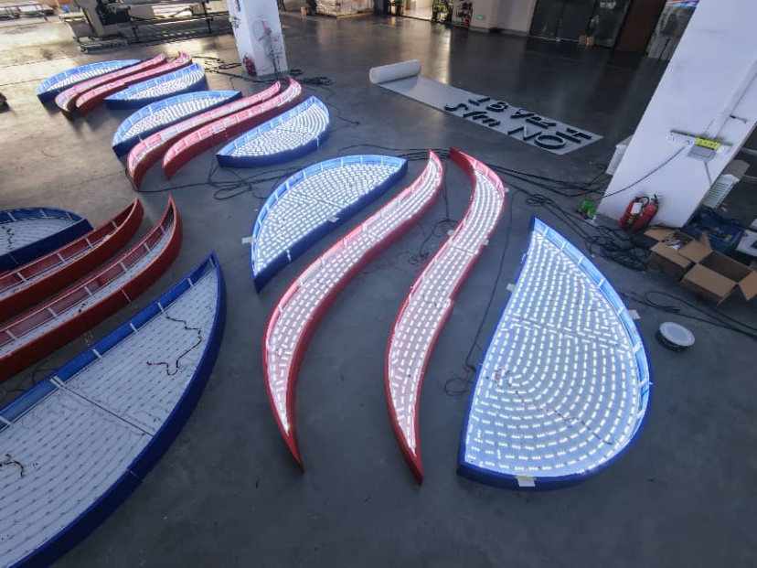
01 Price Shopping Without Comparing Materials and Specs
A wide price gap in signage quotes usually isn't about someone overcharging. It's about completely different material choices. Take an aluminum panel: anodized finish vs. standard spray paint can mean two to three times the cost—but also a world of difference in durability and visual quality. Compare prices blindly, and you might end up with something that looks the same but starts falling apart in a week.
Tip: Before comparing quotes, lock down the material and process specs first. Make sure you're comparing apples to apples.
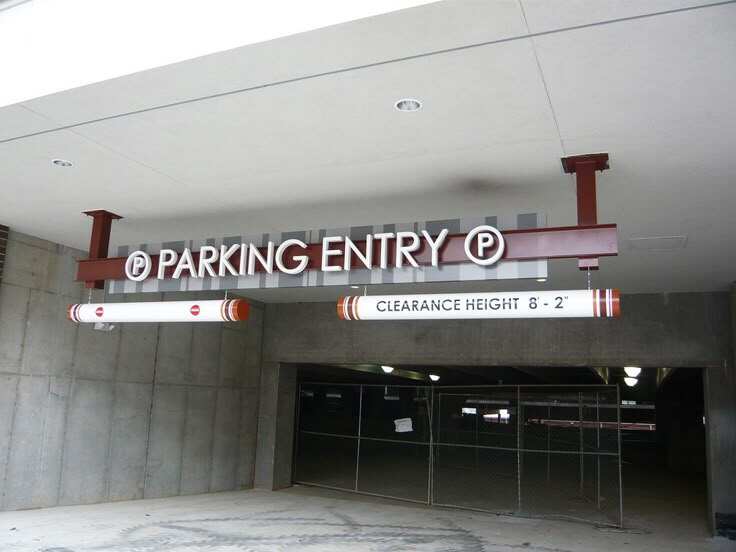
02 Fancy Design Drawings, but No Real-World Scene Planning
Many clients jump straight from beautiful designs to production, skipping a critical step: scene-based planning. For example, what's the user's path from the main entrance to the elevator, and from the elevator lobby to the floor hall? What size sign is needed where? Without mapping this out beforehand, you'll end up with signs that look great on screen but feel "off" once installed.
Tip: Do a user flow analysis before you design—trace the journey from entry to destination.
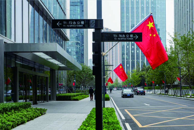
03 Ignoring Local Codes and Accessibility Requirements
You can't just make public signs however you want. Most cities and regions have clear regulations, including fire evacuation sign sizes and locations, accessibility requirements, and even color contrast rules. Discovering non-compliance late means rework or fines—wasted time and budget.
Tip: Confirm local signage regulations at the very start. Better yet, have a professional team do a code review early.
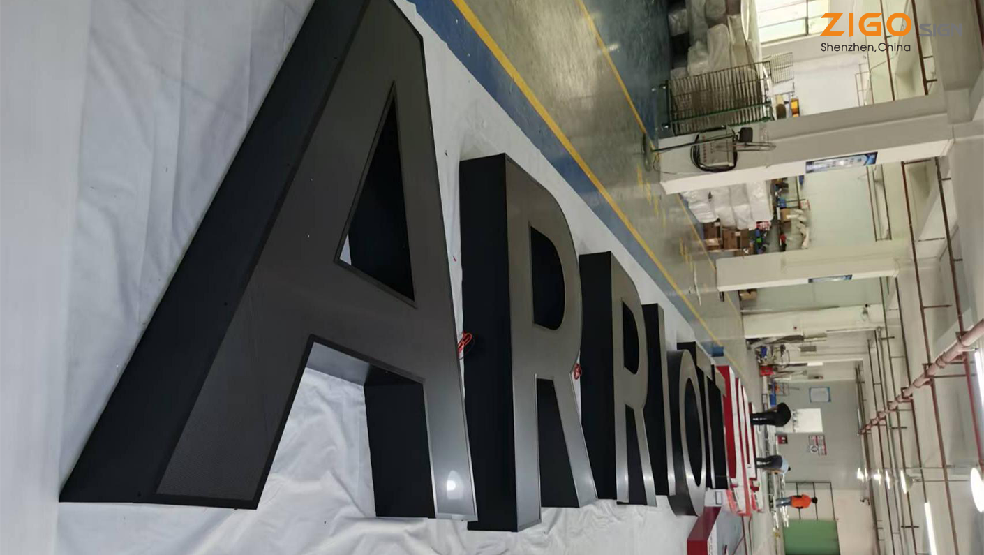
04 No Centralized Font and Color Management
Long project timelines and multiple stakeholders often lead to this: three different typefaces in one building, uneven shades of the same color. The result looks pieced together and kills brand consistency. For hotels and high-end office towers, that kind of detail makes the entire project feel unprofessional.
Tip: Create a complete visual standards manual (Design Guideline) at the beginning. Use it as the single source of truth for every sign.
05 No Room for Future Updates or Maintenance
Shops change in a mall. Hotel room numbers get reassigned. Companies move departments. These changes happen all the time. If you didn't build in replaceability, swapping one room number could mean tearing apart an entire panel and starting over—costly and time-consuming.
Tip: Design with modularity and replaceable inserts from day one. Make maintenance quick and painless.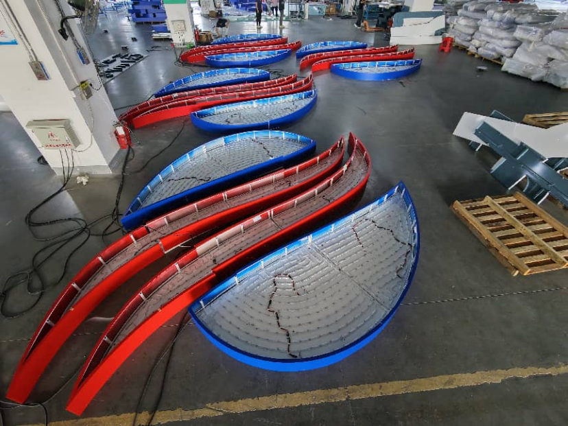
06 Using the Same Materials Indoors and Outdoors
Outdoor signs take sun, rain, wind, and temperature swings. Indoor signs don't. Many projects try to save money by using identical materials for both. Six months later, outdoor signs are fading and blistering. Then you're stuck: replace them or leave them looking shabby.
Tip: Specify weather-rated materials for outdoors (e.g., aluminum with UV-resistant coating). Choose separately for indoor use.
07 Skipping On-Site Installation Verification
Drawings look fine on paper, but on site you discover a pipe in the way, an unsuitable wall for drilling, or the wrong light angle. If these issues surface at the last minute, you either rush a redesign or compromise on placement—neither works well.
Tip: Do a thorough on-site survey before finalizing designs. Confirm actual conditions at every mounting point.
08 Overlooking Nighttime Visibility and Lighting
A sign that looks great in daylight can turn into a disappointment after dark—especially outdoor building signs or directories. Without careful lighting planning (internal illumination, external floodlights, or embedded LEDs), the nighttime effect can be downright poor.
Tip: Determine the lighting scheme during the design phase. A nighttime rendering is non-negotiable.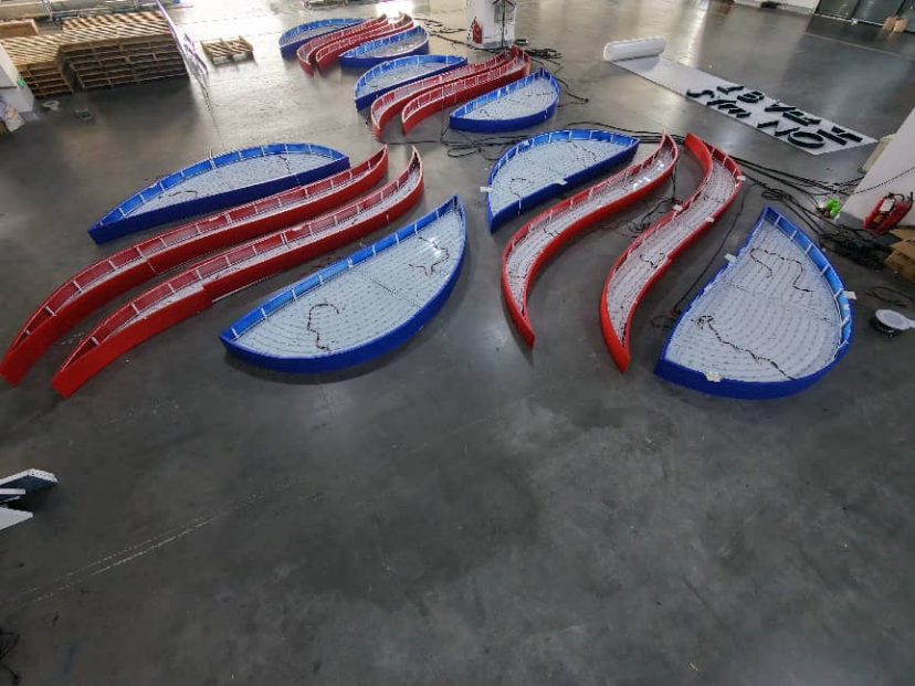
09 Cluttered Information Hierarchy—Users Get Confused
A sign's core job is to guide. But many projects cram too much onto one panel: floor numbers, room IDs, contact phone numbers, QR codes—all competing for attention. When nothing stands out, even the most beautiful design becomes useless. It just confuses people.
Tip: Strictly prioritize your information. Follow the "one sign, one core message" principle.
10 No Formal Post-Installation Walkthrough
Once all signs are mounted, many clients consider the job done. But problems often only surface after real use—a letter size that's too small to read from a distance, a sign installed at an awkward angle, protective film left unpeeled. Without a systematic handover inspection, you'll end up fixing these one by one, burning endless hours.
Tip: Do a complete on-site inspection at delivery. Use a checklist. Log every issue.
Make Your Signage the First Impression of Your Brand
Signage and wayfinding may seem like a small detail. But it's the very first interaction every visitor has with your space. Done right, it silently communicates professionalism and trust. Done wrong, it plants a quiet question mark in people's minds.
Copyright © 2025 by SHENZHEN ZIGO SIGNAGE COMPANY LIMITED Privacy policy


 Hot News