
Interior Signage as Integrated Architectural Expression
From Wayfinding Tool to Spatial Design Element
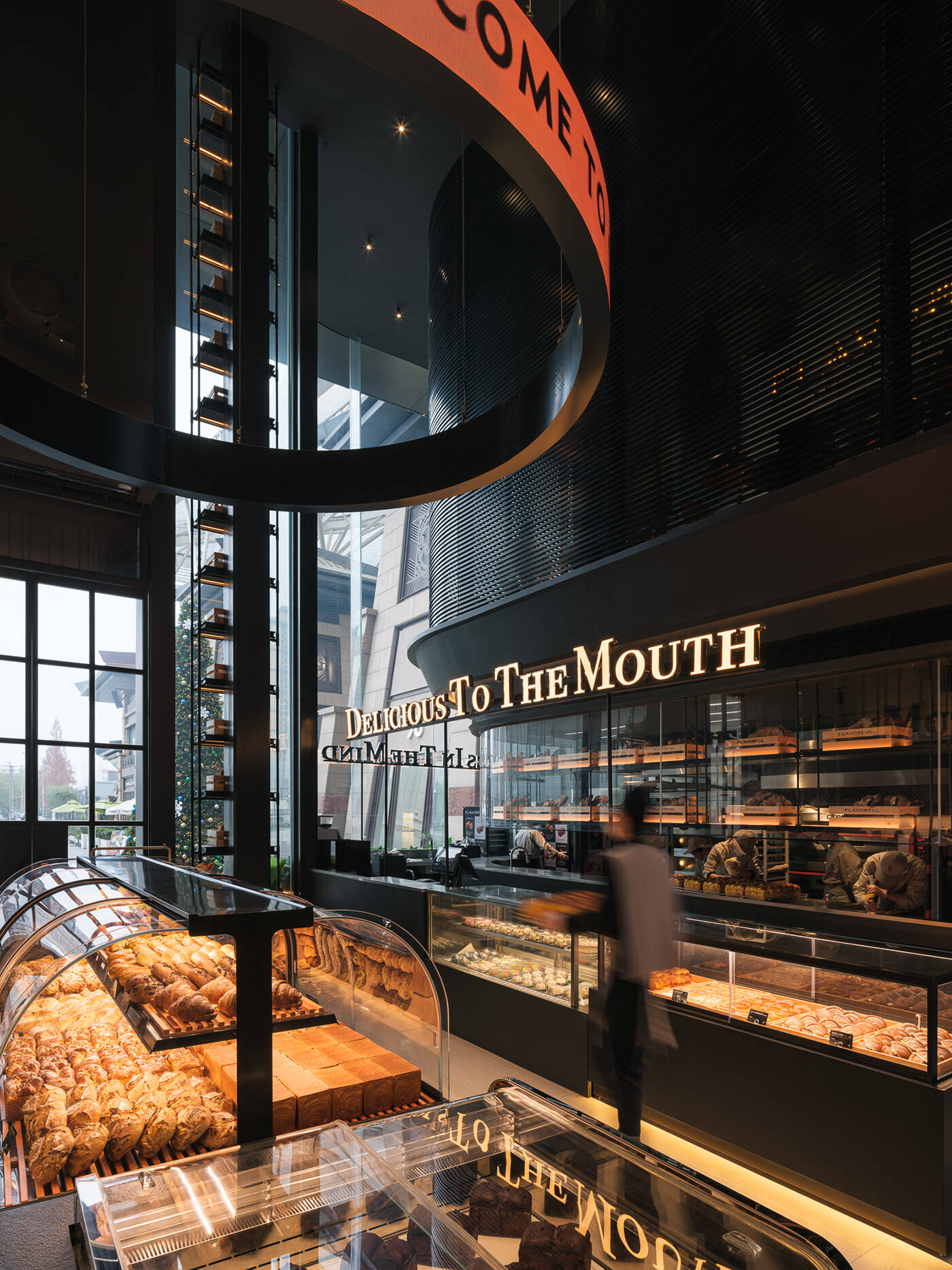
Signage inside buildings isn't just about pointing people in the right direction anymore. It's become something much more important for how we experience spaces overall. Good signage today actually works with the architecture instead of fighting against it, helping folks find their way around while still looking great. When done right, signs blend into their surroundings. Think about those simple text displays in art galleries that guide visitors without stealing attention away from the actual artwork. Signs have moved from being afterthoughts stuck on walls to becoming part of the overall design plan. Spaces tell better stories when this happens, and brands get stronger connections with visitors as they move through environments where each sign feels like a natural part of the experience rather than an interruption.
Design Continuity: Aligning Signage With Structural Rhythm and Proportion
Good interior signage works with the building's architecture instead of fighting against it. When signs match the proportions of the space and follow similar spacing patterns as other elements, they just fit better overall. Think about how tall signs in big lobby areas actually make those spaces feel even taller. And when we put smaller repeating signs down hallways, they start to look like part of the design rather than random additions. This kind of thoughtful placement helps people navigate without noticing the signs themselves. Signs become part of the background fabric rather than shouting for attention. The result? People find their way around easier and the whole environment feels more cohesive and intentional.
Material and Color Alignment for Stylistic Cohesion
Selecting interior signage materials to echo architectural finishes
When interior signage goes beyond just pointing directions, it starts to blend seamlessly into the space when the materials match what's already there. Wood signs look right at home next to those timber walls or old beams hanging from the ceiling. Metal letters with that brushed finish work great alongside stainless steel fixtures in contemporary offices. Etched glass signs catch light in ways similar to the windows around them, making everything feel connected visually. Getting these materials to line up makes the signs feel like they belong in the space instead of being slapped on later. Take matte finished signs for instance they fit nicely against rough concrete walls without clashing. And those see-through acrylic panels? They kind of mimic the glass partitions we see so often in business environments, which helps maintain that professional vibe throughout the whole space.
Color palettes that reinforce brand identity and architectural tone
Choosing colors strategically helps connect a brand's look with where it lives. Bright complementary colors stand out nicely in simple spaces, whereas similar tones work better for creating calm vibes in more traditional settings. Take a seafood place that uses dark navy signs with lighter blue touches throughout the room as an example. Or think about those red earth-toned directional signs that fit right into buildings inspired by desert landscapes. The important thing is making sure there's enough difference between what's written and what's behind it. Experts recommend at least a 4.5 to 1 contrast ratio not just because it looks good but also to meet accessibility standards. This attention to color contrast actually helps people navigate spaces better while telling a visual story about the environment they're in.
Typography, Lighting, and Spatial Readability in Context
Typeface selection and illumination strategies for harmonious interior signage integration
Good interior signs work when they combine good typefaces with proper lighting to make things readable in space while still matching the look of the building itself. Most folks go with sans serif fonts these days like Helvetica or Arial because they have those clean straight lines that are easy to read from about 10 to 30 feet away. When figuring out font sizes, remember to scale them properly. A good rule is to make sure each letter is at least one inch tall for every ten feet between the sign and where people will be standing. Bold letters and strong contrast combinations, say black text against white background, really help people see better in all kinds of lighting situations. Some studies even show this can cut down eye fatigue by around 40% in busy spots. Lighting matters too. LED backlights save power but still give great visibility. Directional lights cut down on annoying glare and shadows, working well with whatever existing lighting is already there. Everything needs to match what's going on architecturally though. Simple fonts and muted colors fit right in with modern buildings, while fancy script fonts paired with warm lighting tend to work better in older, more traditional spaces. Before finalizing anything, it pays to test prototypes at actual size in real locations. Try them out in both brightly lit areas and darker corners to see how they actually perform. Signs that blend naturally into the environment become part of the space instead of just sticking out as something added later.
FAQ Section
Why is interior signage important in architecture?
Interior signage enhances user experience by aiding navigation and integrating with architectural design to create cohesive environments.
How do materials and colors affect interior signage?
Materials and colors help the signage blend seamlessly into the space, reinforcing brand identity and architectural tone.
What typefaces are best for interior signage readability?
Sans serif fonts like Helvetica and Arial are preferred for their clean lines and readability from distances of 10 to 30 feet.
How should lighting be incorporated into signage design?
Directional and LED lighting can be used to ensure visibility while syncing with existing architectural aesthetics.