
First Impressions: How Exterior Hotel Signage Anchors Brand Identity
Psychological impact of facade signage on guest perception and arrival experience
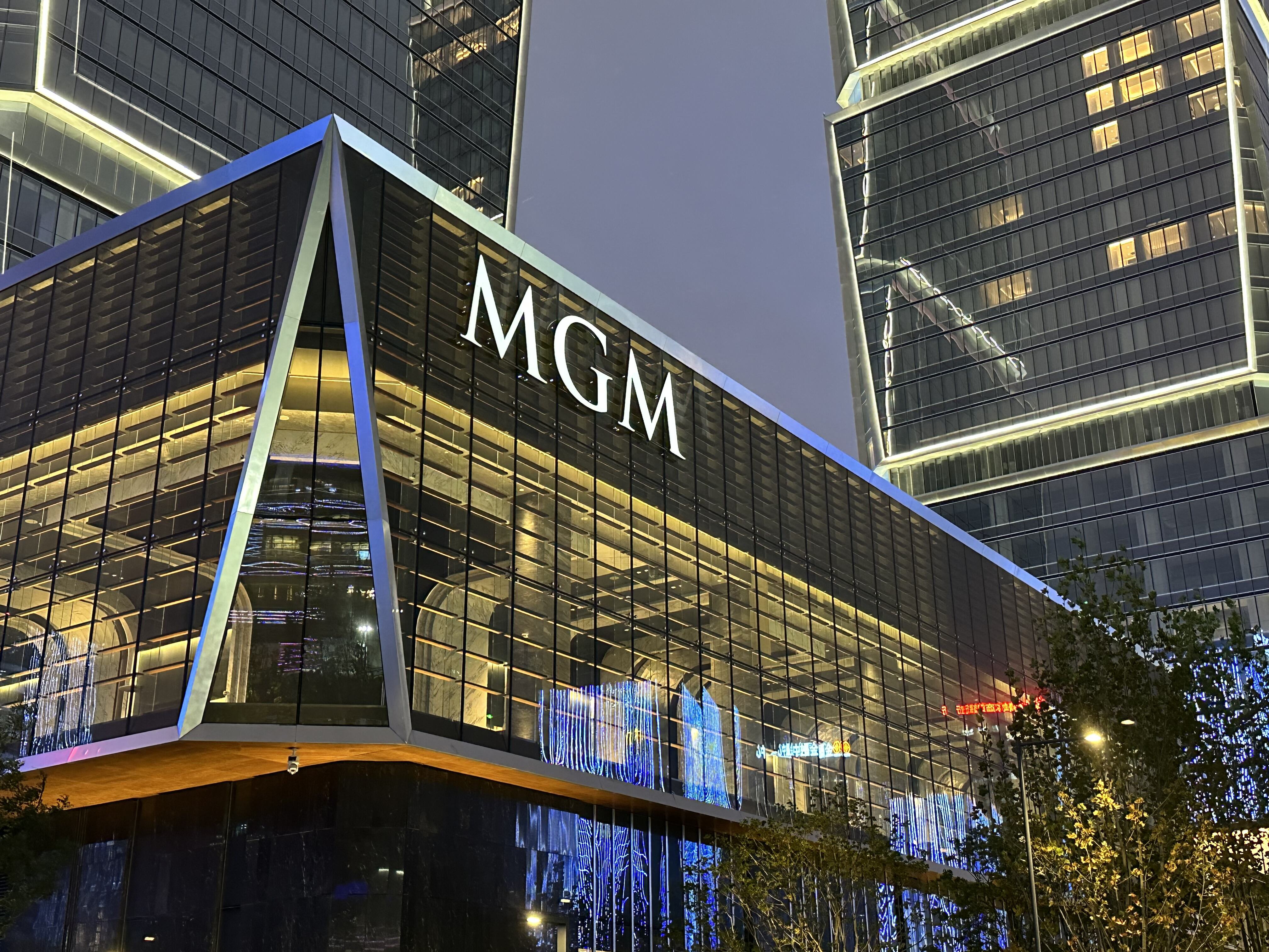
The outside sign of a hotel really sets the stage for what guests expect when they walk in. Studies indicate something like two thirds of people staying at luxury hotels make their mind up about the place within just seven seconds of arriving, so good looking signs matter a lot to how valuable the brand seems. When it comes to designing these signs, certain choices work on people without them even realizing it. Lights on the sign create a welcoming feel once night falls, making the hotel seem approachable. Simple fonts tell visitors this is somewhere contemporary and sure of itself. And then there are those fancy materials like bronze or glowing onyx that scream quality and specialness, letting everyone know this isn't just another hotel but one worth remembering.
These visual cues establish emotional connections that elevate perceived service quality—even before staff interaction begins. Guests intuitively associate meticulous craftsmanship in signage with attention to hospitality detail, increasing perceived value by up to 23%, per peer-reviewed hospitality design studies.
Case study: The Ritz-Carlton's monogram — consistency, scale, and architectural dialogue
The Ritz-Carlton exemplifies how an iconic symbol becomes synonymous with brand excellence—not through repetition alone, but through disciplined execution across three principles:
| Principle | Implementation | Guest Impact |
|---|---|---|
| Consistency | Monogram replication across 120+ locations | 94% brand recognition among luxury travelers |
| Scale | Oversized installations (avg. 4m height) | Projects authority and permanence |
| Architectural Dialogue | Custom integration with building materials | Creates site-specific artistry |
By embedding the monogram into structural elements—rather than applying it as surface decoration—the brand transforms signage into experiential landmarks. The emblem's patina evolves alongside the property's history, silently communicating heritage. This approach yields 2.3x more guest photography than standard signage, turning wayfinding into shareable storytelling.
Materiality and Typography: Core Elements of Authentic Hotel Signage
Material and typeface choices form the tactile and visual foundation of luxury hotel signage—reinforcing brand prestige through physical presence and visual rhythm.
Tactile luxury: Why bronze, machined stone, and brushed brass define premium hotel signage
Luxury properties tend to go for heavy duty metals and real stone because these materials just feel different somehow. Take bronze for instance it gets this beautiful greenish sheen as years pass by, which tells people something about history and tradition. Granite when properly cut feels solid and cold to touch, almost like it will last forever. And then there's brass that's been rubbed down smooth it reflects light in ways plastic never can, creating this warm glow that synthetic stuff just cant match. The best part? All these materials hold up really well in places where lots of people walk around all day long. They look great while still being tough enough to handle constant use without showing wear and tear, which makes them perfect choices for high end signs that need both style and substance.
Serif vs. sans-serif: How typographic choices reinforce heritage, modernity, or timelessness in hotel signage
When it comes to serif fonts, think Trajan or Garamond they bring to mind those old engraved plaques we see on historic buildings. These fonts create a sense of trust because of their classic look, which is why so many heritage brands stick with them. On the flip side, clean sans-serif fonts like Futura or Helvetica Neue really work well with modern architecture. They cut out all the extra visual clutter and let people focus on the actual structure lines. Resorts that want to feel both timeless and welcoming often go for hybrid fonts. These combine the serious weight of serifs with the open feel of sans-serifs. The result? Guests can navigate around without getting lost, which matters a lot since studies show about 8 out of 10 visitors get frustrated when signs aren't clear enough.
Seamless Integration: Architectural Harmony in Luxury Hotel Signage Design
Embedded signage systems: Structural cohesion in Aman, Four Seasons, and The St. Regis portfolios
Luxury hotel signs really stand out when they become part of the building itself rather than just slapped on later. Take Aman properties for instance they actually build those brass room numbers right into their custom wooden walls. At Four Seasons hotels, the elevator buttons are hidden inside the stone columns so nobody even notices them until they need to press one. And don't get me started on The St. Regis where those glass directories look like they grew out of the floor instead of being stuck there. Getting this kind of integration right takes serious teamwork between architects and sign makers way back when blueprints are still just sketches. The materials used, how big things are, everything has to match what makes sense for the overall look and feel of the space.
When bronze wayfinding plaques emerge seamlessly from travertine walls—or backlit acrylic symbols float within metal screens—visual clutter vanishes. Navigation becomes intuitive, and perceived quality rises. Leading design studios report 30% higher ambiance satisfaction scores when signage is structurally integrated during construction versus retrofitting.
Discreet Functionality: Wayfinding and Touchpoint Consistency Across the Guest Journey
From lobby to spa — how interior hotel signage delivers silent, intuitive service without compromising aesthetics
High quality interior signs act like quiet guides helping visitors move around spaces using easy to understand visuals without messing up the overall design feel. Materials like satin metal surfaces, matte glass, and softly lit panels blend right into building designs so that directions don't stick out or ruin the atmosphere. When typefaces are organized properly and signs sit at eye level throughout a space, people just naturally find their way from registration desks to restrooms and other facilities without even thinking about it. Good signage makes navigation effortless for everyone who walks through the doors.
When hotels stick to one consistent design style throughout their spaces, guests notice it everywhere they go. Same colors show up on those little directory boards near elevators, bathroom signs, even at the entrance to the spa area. This kind of visual consistency doesn't just look good - it actually makes people feel like they're experiencing something special and luxurious as they move around the property. According to some recent studies from hospitality experts back in 2023, places that have implemented these kinds of design systems see about 72 percent fewer cases where guests get lost or confused. What happens then? Guests navigate the space almost effortlessly because everything looks familiar and comfortable. Instead of big bold signs telling them where to go, subtle design choices guide them along without being too obvious about it.
FAQ Section
What materials are best for luxury hotel signs?
Luxury hotel signs typically use materials like bronze, machined stone, and brushed brass due to their durability and premium feel.
How does signage impact guest perception?
Signage impacts guest perception by creating emotional connections and establishing brand excellence, often within the first few seconds of arrival.
Why is typography important in hotel signage?
Typography is important in hotel signage because it reinforces the overall brand identity, representing heritage, modernity, or timelessness based on the font choices.
How can signage be integrated into hotel architecture?
Signage can be integrated by embedding it into the building structure, creating a cohesive and seamless interaction between the signage and architecture.
Does consistent signage design affect guest navigation?
Yes, consistent signage design throughout hotel spaces helps guests navigate more easily and reduces confusion or frustration.
Table of Contents
- First Impressions: How Exterior Hotel Signage Anchors Brand Identity
- Materiality and Typography: Core Elements of Authentic Hotel Signage
- Seamless Integration: Architectural Harmony in Luxury Hotel Signage Design
- Discreet Functionality: Wayfinding and Touchpoint Consistency Across the Guest Journey
- FAQ Section