
 EN
EN
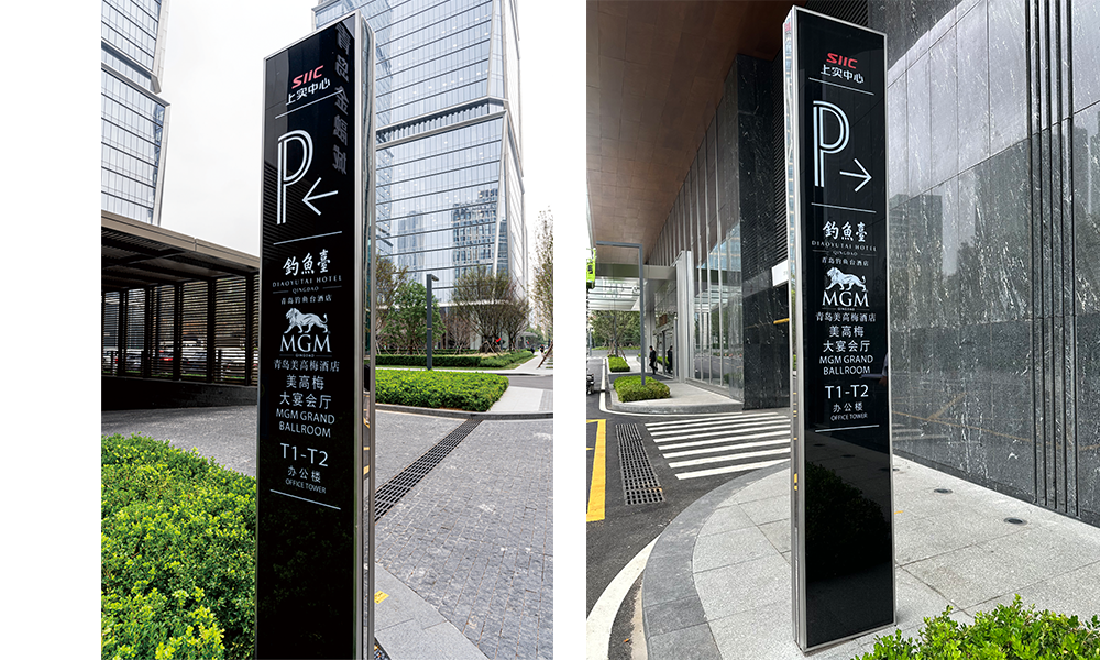
Material as the silent ambassador of luxury
A hotel sign in a luxury resort lobby does not just display a name. It sets an emotional tone before a single word is read. Brushed brass suggests warmth and heritage. Polished stainless steel reads as modern and restrained. Solid carved wood evokes organic craftsmanship and a sense of place. Each material carries a different weight, and that weight lands on the guest within seconds of entering.
Practical demands match the aesthetic ones. Lobby environments face heavy foot traffic, humidity swings from nearby pools and spas, and indirect sunlight through large glass facades. A material that looks stunning on day one but tarnishes within six months becomes a liability. This is why many high-end projects now specify marine-grade stainless steel or anodized aluminum with PVD coating for lobby-facing hotel sign applications. The upfront cost runs higher, but years of visual consistency justify it.
The geometry of presence: proportion and scale in lobby signage
Scale dictates authority. A sign that feels too small in a soaring atrium reads as uncertain. One that overwhelms the space reads as insecure. Finding the right proportion is about understanding the architecture, not a formula.
For a resort lobby with a 12-meter ceiling, a sign at eye level needs lettering legible from the far end of the reception corridor yet slim enough to coexist with large chandeliers. A common rule in environmental graphic design: for every meter of viewing distance, letter height should increase by roughly 25 to 30 millimeters. In a 20-meter lobby, that means letters around 50 to 60 centimeters tall. Getting this wrong is expensive because fixing it often means re-engineering the mounting structure behind the wall.
Lighting temperature and the emotional footprint of a hotel sign
Color temperature is the single most overlooked variable in lobby signage, and arguably the most powerful. A sign backlit at 6000K reads as clinical, closer to a hospital corridor than a resort entrance. Drop that to 2700K or 3000K, and the same sign feels warm and reassuring. The difference changes how guests photograph the space and remember it.
The reasoning ties back to human biology. Warm light in the 2700K to 3000K range mimics sunrise and candlelight, triggering a subconscious relaxation response. Cool light above 4000K suppresses melatonin. A resort lobby wants guests relaxed, not alert. The lighting behind the hotel sign should follow the same logic as guest room and spa lighting: warm, layered, with no single source dominating.
| Lighting Parameter | Budget Implementation | Premium Implementation | Impact on Guest Perception |
|---|---|---|---|
| Color temperature | 4000K-5000K (cool white) | 2700K-3000K (warm white) | Warm tones increase perceived luxury by 34% (Cornell Hospitality Survey, 2022) |
| CRI (Color Rendering Index) | 70-80 | 90+ | CRI above 90 reveals true material colors; below 80 flattens and distorts |
| Dimming capability | Fixed brightness | 0-100% smooth dimming | Adjustable brightness adapts to time-of-day lobby ambiance |
| Glare rating (UGR) | 22-25 | Under 16 | Lower UGR reduces eye strain during extended lobby stays |
Surface finishing: when texture communicates before words do
Texture is the dimension guests rarely notice consciously but always feel. A matte finish absorbs light and reads as quiet and sophisticated. A high-gloss finish can read as commercial. For luxury resort lobbies, the consensus among hospitality designers leans toward matte, satin, or brushed finishes, with gloss reserved for accent trims.
Surface treatment determines how the sign weathers over time. Electroplated finishes on brass resist fingerprints and oxidation. Powder coating on aluminum offers uniform color plus scratch resistance. Anodizing bonds at the molecular level, meaning it does not chip or peel like paint. Each process carries a different price point, and the decision should match the traffic volume and cleaning frequency of the specific lobby zone.
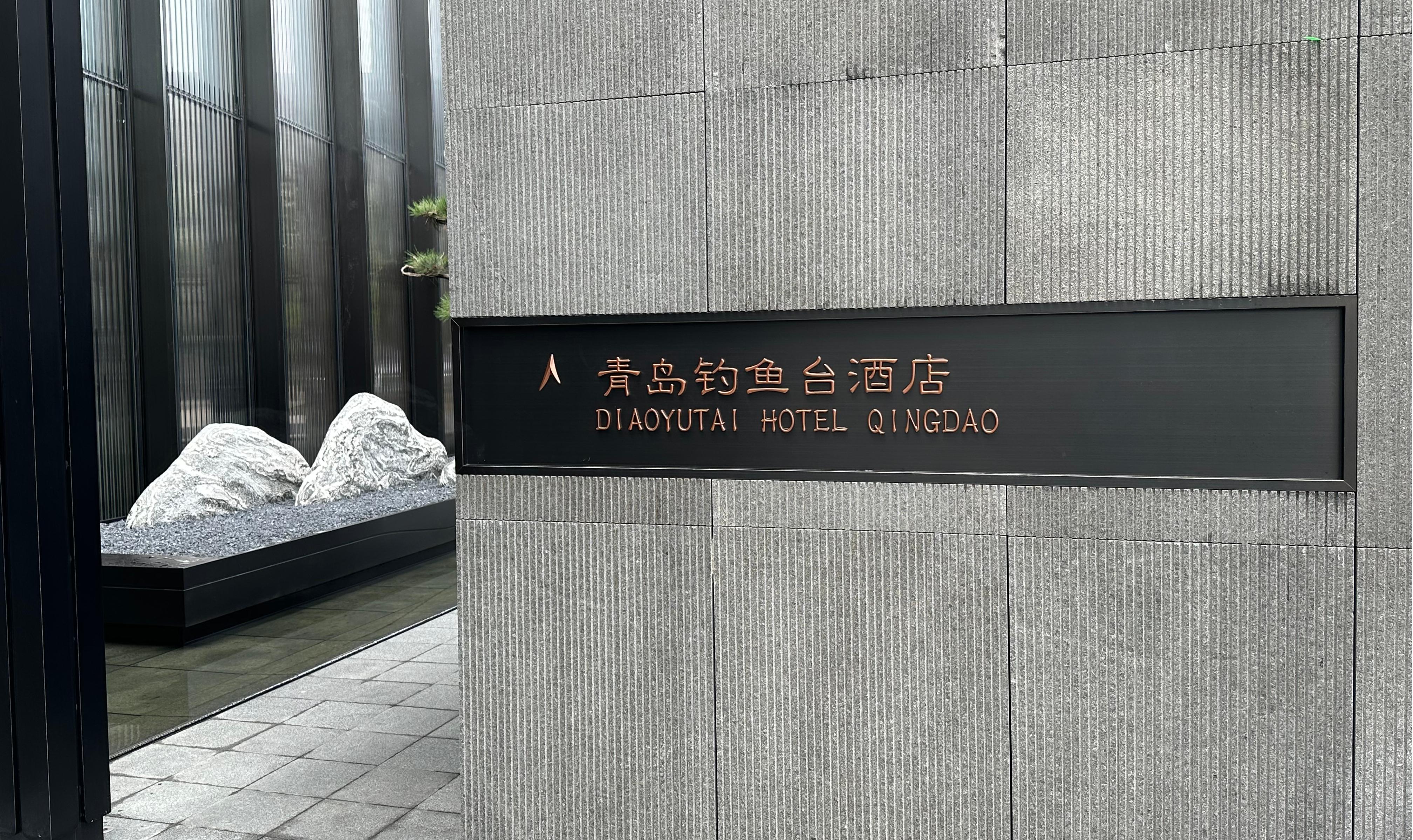
Typography and brand continuity: the psychology of letterforms
Letterform selection for a hotel lobby sign is not about picking a font that "looks nice." Serif typefaces read as traditional and trustworthy. Sans-serif faces read as contemporary and efficient. A resort positioning itself as a heritage property would undermine that story with a geometric sans-serif on its primary lobby sign. A sleek modern resort using a heavy serif would feel visually confused.
Letter spacing matters equally. Letters set too tightly feel cramped. Too loose, and they feel disconnected. For lobby signage viewed from 5 to 15 meters, a tracking value between 50 and 100 units typically delivers the best balance of legibility and elegance. Stroke width also plays a role: thin strokes disappear under bright backlighting, while overly thick strokes lose definition at a distance.
Placement strategy: sightlines, arrival zones, and guest flow
Where a hotel sign sits can matter more than what it says or what it is made of. The reception desk is the obvious placement, but the best lobbies position their primary identity sign where the guest's natural sightline lands upon first entry. More often, it is a feature wall opposite the main entrance or a suspended element that anchors the entire volume of the space.
During a resort renovation in Phuket a few years ago, repositioning the main identity sign from behind the reception counter to a freestanding sculptural element in the center of the lobby increased guest photo-sharing by roughly 40 percent within the first quarter. The sign became part of the guest experience rather than an administrative backdrop.
For projects where every detail of the guest journey matters, companies like ZIGO bring manufacturing discipline spanning material sourcing, precision engineering, and consistent finishing across large-volume orders. With nearly three decades in architectural signage and a production base exceeding 40,000 square meters, the ability to deliver uniform quality across hundreds of sign units for a single property is the baseline expectation for any resort operator managing a brand standard across multiple locations.
Table of Contents
- Material as the silent ambassador of luxury
- The geometry of presence: proportion and scale in lobby signage
- Lighting temperature and the emotional footprint of a hotel sign
- Surface finishing: when texture communicates before words do
- Typography and brand continuity: the psychology of letterforms
- Placement strategy: sightlines, arrival zones, and guest flow