
The Strategic Role of Exterior Signage in Building Brand Visibility
How exterior signage strengthens brand visibility in local markets
Signs outside buildings work as constant brand representatives, particularly important for shops trying to attract nearby shoppers. Research from FedEx Office last year showed around three out of four people walk into stores they don't know simply because the sign caught their eye. That makes exterior signs some seriously good value for money when it comes to ongoing marketing. Putting these signs where lots of people pass through, such as busy corners or mall entrances, gives them about four times better exposure compared to what happens inside the store itself. Service oriented companies will find that having clear direction signs helps customers find them easier too. The Wayfinding Institute reports this kind of signage boosts customer awareness by roughly a third for those types of businesses.
The connection between consistent signage and brand recognition
Consistent design across exterior signage accelerates brand recall by 72%, per neuromarketing research. Key elements include:
- Color Consistency: Using brand-specific colors enhances recognition by 80% (Pantone 2023)
- Logo Placement: Centered logos are retained 40% better than corner-placed versions
- Typography: Uniform fonts across all signage improve perceived trustworthiness by 28%
Businesses using standardized signage templates experience 19% higher repeat visitation, according to a University of Cincinnati study (2023), highlighting how visual consistency fosters customer loyalty.
Case study: Brands that increased foot traffic through strategic exterior signage
A regional grocery chain achieved measurable gains through a coordinated signage strategy:
| Strategy | Implementation | Result (6 Months) |
|---|---|---|
| Illuminated Pylon Sign | 35ft structure visible from highway | +42% drive-by traffic |
| ADA-Compliant Walkway Signs | Directional panels to parking | -68% customer confusion |
| Color-Stabilized Vinyl | Fade-resistant brand colors | $92k saved annually |
This integrated approach boosted local brand visibility by 310% in market surveys, illustrating how multi-format signage compounds impact when strategically aligned.
Design Principles for Highly Visible and Legible Exterior Signage
Key Factors Affecting Signage Visibility: Location, Size, and Viewing Distance
Effective exterior signage balances three core factors:
- Location: Position signs near high-traffic zones—intersections, pedestrian paths—while avoiding obstructions like trees or buildings that block sightlines
- Size: Apply the 1-inch-per-10-feet rule: text height should increase by 1" for every 10' of viewing distance
- Viewing Distance: Roadside signs for drivers at 55 MPH require 18"-24" letter heights; pedestrian signs perform well with 3"-6" characters
To maximize effectiveness, signage must meet four benchmarks: detectability, conspicuity, legibility, and comprehensibility (Signage Design Principles).
Applying Design Principles for Effective Signage: Simplicity, Contrast, Spacing
Outdoor signs succeed when designed for instant comprehension:
- Simplicity: Limit messaging to seven words or fewer—drivers process signs in under three seconds (Traffic Safety Institute 2023)
- Contrast: High-contrast combinations like black-on-yellow improve readability by 38% versus low-difference palettes
- Spacing: Maintain 30%-50% negative space between elements to reduce visual clutter and enhance focus
Font Selection and Readability: Best Practices for Outdoor Legibility
Prioritize clarity with functional typography:
- Use bold, sans-serif fonts (e.g., Arial, Helvetica) with stroke widths at least 15% of character height
- Avoid thin, script, or decorative typefaces that degrade under sunlight or at speed
- Maintain a 0.5:1 height-to-width ratio for optimal character distinction
Balancing Impact and Clarity: Minimalism vs. Visual Richness in High-Traffic Zones
In fast-moving environments, minimalist designs outperform visually complex ones:
| Minimalist Design | Visually Rich Design | |
|---|---|---|
| Best For | Quick communication (store names, directions) | Detailed messaging (promotions, brand storytelling) |
| Ideal Locations | Highways, intersections | Pedestrian malls, office complexes |
| Readability Range | 300+ feet | 50 feet |
Gas stations using minimalist highway signs report 27% faster brand recall compared to text-heavy alternatives.
Embedding Brand Identity into Exterior Signage Design
Exterior signage is more than wayfinding—it’s a physical extension of your brand identity. Companies with unified visual branding achieve 47% higher recognition in competitive markets (Branding Institute, 2023), emphasizing the importance of integrating brand DNA into every sign.
Integrating Logos, Colors, and Slogans to Ensure Branding Consistency
Logos should occupy 15–20% of a sign’s surface for clear visibility beyond 50 feet, paired with high-contrast color schemes aligned to brand guidelines. Franchises using signature color pairings—like red-and-white in channel letters—achieve 89% faster customer recognition than those with inconsistent hues (Outdoor Advertising Report, 2023).
Color Psychology in Signage Design: Evoking Emotion and Brand Alignment
Color choices influence behavior: deep blues in healthcare settings convey reliability, while bright yellows in retail create urgency. According to a 2023 Stanford study, emotionally resonant color use increases foot traffic by 34% compared to neutral palettes.
Customizing Outdoor Signs to Reflect Unique Brand Personality
Brand authenticity drives engagement. A craft brewery using weathered steel and hand-lettered typography in its monument sign saw a 72% higher engagement rate than standard designs (Signage Innovation Journal, 2024), proving that personality-infused signage builds stronger connections.
Ensuring Cross-Channel Coherence with Exterior Signage
Align exterior signage with digital touchpoints: mirror website fonts in pylon signs and extend social media visuals to awnings. Brands maintaining omnichannel visual consistency see 2.3x longer dwell times near physical locations.
Choosing the Right Type of Exterior Signage for Optimal Brand Exposure
Channel Letters and Their Premium Visual Impact for Storefronts
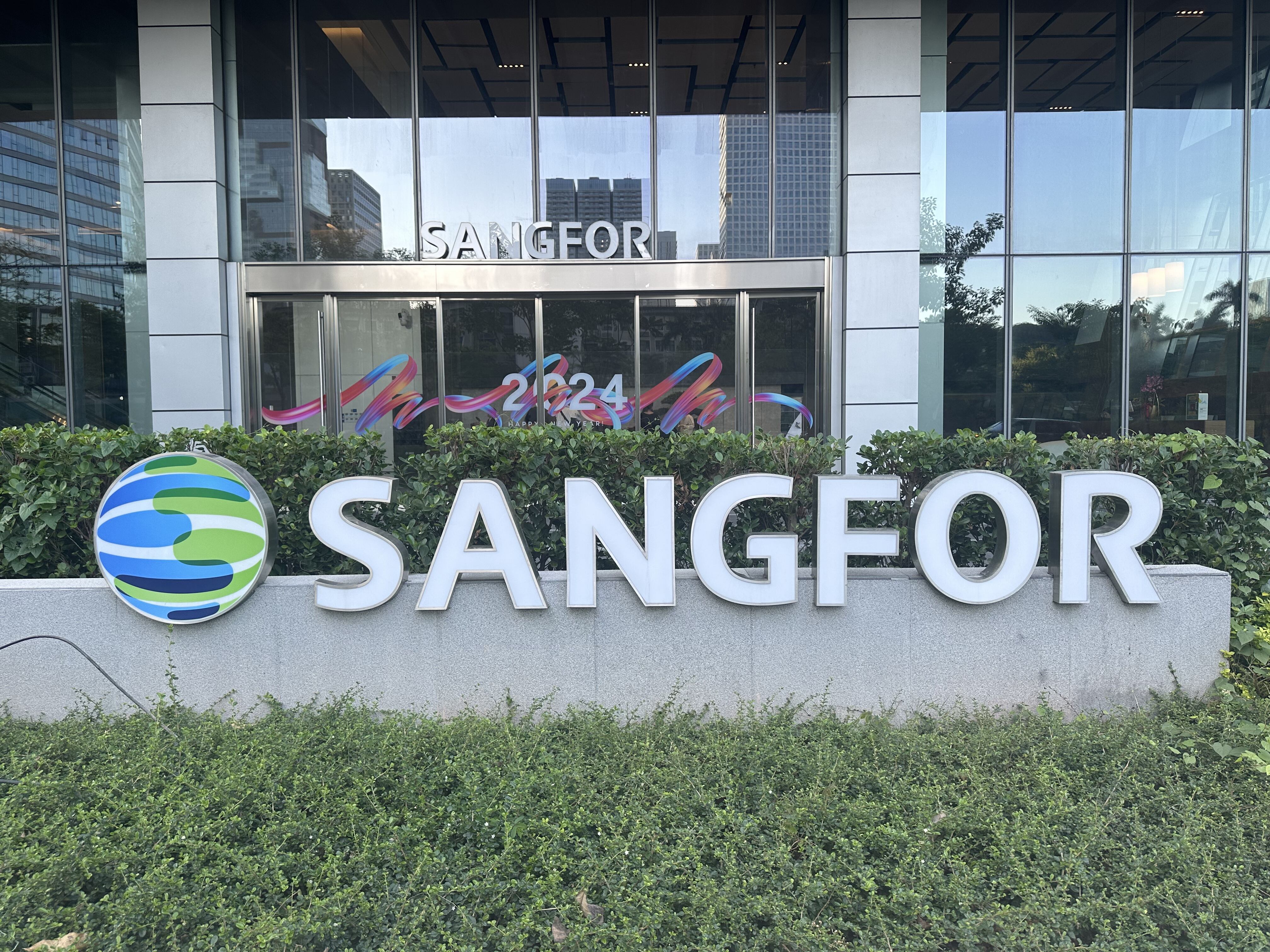
Channel letter signs really stand out on store fronts because of their three dimensional look and all those lighting options available. According to some research from last year in the retail sector, stores using lit up channel letters saw about a 27 percent increase in people recognizing their brand compared to just regular flat signs. These letters can be made in pretty much any font style, come in various colors, and offer different lighting choices like front lighting, back lighting, or even that nice halo effect around the edges. Most businesses find these work great with their existing branding guidelines and keep their signage visible day and night, which is why so many restaurants and shops in busy city areas rely on them for constant exposure.
Monument Signs: Combining Durability With Neighborhood Branding
Monument signs work great in neighborhoods and business parks where there are limits on how tall things can be. These signs stick around for about 10 to 15 years before needing much work at all. Made from stuff like real stone, bricks, or metal, they just sit there looking good without constant maintenance. People actually remember them better too. Take this one doctor's office down the street that put up a big monument sign instead of those flashy digital boards everywhere else. According to a recent survey done last year, folks in the area remembered where the clinic was located 25 percent more often compared to other businesses using electronic advertising.
Pylon Signs and Their Effectiveness for Highway Visibility
Pylon signs dominate high-speed corridors with vertical structures offering 1/2 mile visibility. Typically spanning 150–400 sq ft, they feature large, bold lettering ideal for passing traffic. A gas station chain saw a 40% increase in drive-by visits after installing dual-faced pylon signs, according to a 2023 traffic analysis.
Comparative Analysis: ROI of Different Exterior Signage Types
| Sign Type | Avg. Cost | Lifespan | Best Use Case | ROI Considerations |
|---|---|---|---|---|
| Channel Letters | $8,000-$15k | 8-12 yrs | Urban retail storefronts | Night visibility drives evening sales |
| Monument Signs | $12k-$30k | 10-15 yrs | Office parks/medical centers | Low maintenance adds long-term value |
| Pylon Signs | $25k-$80k | 15-20 yrs | Highway-facing businesses | Extended visibility converts passing traffic |
Matching sign type to location-specific traffic patterns improves ROI by 18–33%, per a 2024 outdoor advertising effectiveness report, underscoring the value of strategic selection.
FAQ
What types of businesses benefit most from exterior signage?
Businesses that benefit most from exterior signage include retail stores, restaurants, service-oriented companies, and any business with a physical location that relies on attracting local foot traffic.
How does consistent design across signage help my brand?
Consistent signage design enhances brand recall, improves perceived trustworthiness, and fosters customer loyalty by providing a cohesive visual identity across all touchpoints.
What are the key design principles for effective exterior signage?
Key design principles include maintaining simplicity, ensuring high contrast, allowing ample spacing, and using readable fonts to ensure signs are easily comprehensible.
How can I integrate my brand identity into exterior signage?
Integrate your brand identity by using logos, signature colors, and slogans consistently across all signs. Ensure these elements align with your brand guidelines for maximum recognition.
What type of signage is best for urban areas?
Channel letter signs are ideal for urban areas because of their 3D look and excellent visibility day and night, which enhances brand recognition in busy city settings.
Table of Contents
- The Strategic Role of Exterior Signage in Building Brand Visibility
-
Design Principles for Highly Visible and Legible Exterior Signage
- Key Factors Affecting Signage Visibility: Location, Size, and Viewing Distance
- Applying Design Principles for Effective Signage: Simplicity, Contrast, Spacing
- Font Selection and Readability: Best Practices for Outdoor Legibility
- Balancing Impact and Clarity: Minimalism vs. Visual Richness in High-Traffic Zones
- Embedding Brand Identity into Exterior Signage Design
- Choosing the Right Type of Exterior Signage for Optimal Brand Exposure
- Channel Letters and Their Premium Visual Impact for Storefronts
- Monument Signs: Combining Durability With Neighborhood Branding
- Pylon Signs and Their Effectiveness for Highway Visibility
- Comparative Analysis: ROI of Different Exterior Signage Types
- FAQ