
Strategic Wayfinding for Seamless Multi-Area Navigation
Good hotel signage makes navigating complicated buildings much easier for everyone involved. When hotels install smart wayfinding systems, guests don't get lost wandering around lobbies, conference areas, or recreation spots because there are clear signs showing where things are located. Top hotel design experts actually plan out directions carefully so people know exactly what to do next after they arrive at the front desk. These professionals map out paths that take visitors smoothly from check-in counters past elevator banks all the way down to their actual rooms, with helpful signs along each step of the journey pointing them in the right direction.
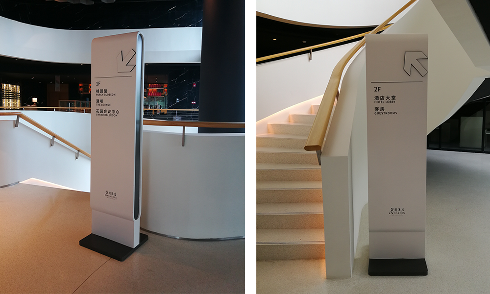
Directional Logic and Floor Identification Systems
The zone-based navigation system groups together similar services like dining areas, spa facilities, and meeting spaces using consistent color codes throughout the building. Research from environmental design experts suggests this approach cuts down on mental strain by around 40%, which makes sense when people don't have to constantly figure out where they are going. For floor identification, we've added tactile numbers alongside Braille markers at all elevator lobbies and stairwell entrances. These are placed at about eye level for most adults, making them easy to spot regardless of mobility challenges. At strategic spots throughout the facility, digital screens show where events are happening right now. The exit signs throughout follow strict safety standards set by the NFPA 101 Life Safety Code, ensuring everyone can find their way out quickly if needed.
Optimized Overhead Sign Placement and Directory Design
Overhead hotel signs achieve maximum impact when mounted 7–8 feet above floor level and angled 30 degrees downward for optimal sightlines. High-traffic intersections demand backlit directional panels featuring:
- A minimum 5:1 luminance contrast ratio
- Non-reflective matte finishes
- 1.5" minimum letter height
Centralized directories near main entrances should use modular panels for easy updates and follow icon standards consistent across all touchpoints. Wayfinding paths that combine overhead cues with wall-mounted markers reduce average navigation time by 62% compared to standalone signage, per the Hospitality Design Institute.
ADA-Compliant Accessibility in Hotel Signs
Braille, Visual Contrast, and Mounting Height Standards
Hotels absolutely need to follow ADA guidelines when installing permanent signage. For tactile features, the rules require characters that are at least 1/32 inch tall, using sans serif fonts, with Grade 2 Braille right underneath each letter. Good contrast matters too. Dark letters on light surfaces work best for people who have trouble seeing clearly, especially when combined with matte finishes that don't reflect glare. Signs should be mounted between 48 and 60 inches off the ground measured from the floor to where the letters start. This standard height helps everyone navigate around the building easily. Failing to meet these standards can lead to lawsuits and worse, it means turning away guests who rely on these accessibility features to move through the hotel safely.
| Critical ADA Feature | Specification Requirement |
|---|---|
| Tactile Character Height | 5/8" to 2" |
| Braille Standard | Grade 2 (contracted) |
| Contrast Ratio | ≥70% light/dark differential |
| Finish | Matte, non-reflective surface |
Tactile Evacuation Maps and Integrated Wayfinding Paths
Accessibility today goes well past those old fashioned static signs we used to see everywhere. Take for instance the new tactile evacuation maps installed next to elevator banks and stairwell entrances. These maps guide people through emergencies using raised lines and Braille text so folks can navigate on their own when things get chaotic. The whole system works because of integrated wayfinding paths with tough rubberized tactile indicators running from main areas like hotel lobbies all the way to emergency exits. Many hotels have actually seen their evacuation times drop significantly during practice drills after installing these systems. Beyond just meeting minimum ADA requirements, this kind of investment shows real commitment to safety and builds trust among guests who might otherwise worry about getting out safely in an emergency situation.
Unified Brand Expression Across All Hotel Signs
Consistent Logo Application, Color Systems, and Typography
Hotel signage needs to carry forward the brand's visual identity consistently across three main components: logos, colors, and typefaces. When logos are placed uniformly and scaled appropriately, it creates smoother guest experiences throughout the property. Some studies indicate that when branding stays consistent, people remember the brand about 80% better than inconsistent ones. The color scheme matters too. Upscale hotels tend to go for metallic touches combined with rich neutral shades, whereas beachfront resorts usually opt for brighter, more energetic colors. Font choices matter just as much. Stick with one main font family for everything from direction boards to room numbers and info panels. Clean sans-serif styles such as Helvetica work well for international visitors who need clear text, while traditional serif fonts can give off a sense of history and elegance. Keeping things visually simple helps avoid confusion and builds that feeling of reliability whenever someone interacts with the brand.
| Design Element | Implementation Tip | Impact on Guest Experience |
|---|---|---|
| Logo | Fixed placement (e.g., top-right corner) | Builds instant recognition |
| Color Palette | PMS/HEX code adherence across materials | Creates emotional consistency |
| Typography | Hierarchy system (headings/body text) | Enhances navigational clarity |
What materials we pick really affects how our brand feels to people. Brushed metal looks super modern these days, whereas wood grains bring that cozy, country vibe. Some research from last year in the hotel business showed something interesting too. Places that kept their signs looking consistent across the property had guests coming back about 27 percent more often than those with mixed up designs. Makes sense when you think about it. The whole place just feels better put together. Don't go crazy with different fonts or random additions. Even small things matter, like the little signs in bathrooms should match what's hanging in the main entrance area. Consistency breeds familiarity, and familiarity builds trust with customers over time.
Durable, Context-Appropriate Materials for Hotel Signs
When picking out materials for hotel signs, there's a delicate balance between how long they'll last, where they're going to be placed, and what looks good aesthetically. Outside signs work best with aluminum or stainless steel since these metals hold up against harsh coastal weather conditions. The brushed finish also helps cut down on unwanted glare from sunlight reflecting off the surface. Inside hotels, acrylic works great when exact color matching matters, whereas wooden signs create that cozy boutique feel especially around spa areas. Weather matters a lot too. Places with high humidity need composite materials that resist moisture buildup, and dusty environments call for surfaces that won't collect dirt easily. Going green makes sense too. Bamboo and recycled plastic alternatives slash environmental impact somewhere around 30 percent according to recent data from the Hospitality Institute in their 2023 report on sustainability practices. Maintenance shouldn't be overlooked either. Signs in busy spots should have coatings that repel fingerprints, and whatever material gets chosen needs to stand up to regular cleaning without showing wear and tear over time.
Frequently Asked Questions (FAQ)
How does wayfinding improve hotel guest experience?
Wayfinding systems in hotels enhance guest experience by providing clear signage and directions, preventing confusion and helping guests navigate smoothly from the front desk to various areas such as rooms, dining, and amenities.
What are the ADA requirements for hotel signage?
ADA requirements for hotel signage include tactile character height between 5/8" to 2", Grade 2 Braille text, a contrast ratio of at least 70% light/dark differential, and matte, non-reflective surfaces.
Why is consistent branding important for hotel signage?
Consistent branding on hotel signage strengthens guest recognition and retention. Uniform logos, colors, and typefaces across signage improve brand recall by around 80% and reinforce emotional connections with the brand.
What are the advantages of using durable materials in hotel signage?
Using durable materials such as aluminum, stainless steel, and composite materials ensures longevity and aesthetic appeal. These materials resist harsh weather, humidity, and dirt, providing sustainable and easy-to-maintain signage options.