Inside buildings with multiple floors such as hospitals or office complexes, interior signs work quietly as guides, employing common symbols and directions to make finding one's way easier. According to research published last year on wayfinding, when signs are put in smart locations, people end up taking wrong turns 62% less often when they're not familiar with the space. Pathways marked with different colors plus branding specific to each floor actually help folks create mental maps without even thinking about it something really important during emergencies when getting information quickly can literally save lives. Looking at how airports are laid out recently shows similar results too. When signs are easy to follow, visitors report feeling anxious 38% less than when faced with walls of text instead.
In busy areas where people are constantly moving, putting directional signs about 10 to 15 feet ahead of where decisions need to be made helps folks adjust their path without coming to a complete stop. Studies on how pedestrians move show that arrows pointing at a 45 degree angle get noticed and understood about 27 percent quicker than those lying flat horizontally. Mall managers have noticed something interesting too. When stores install those big signs hanging from the ceiling, customers tend to walk through the space around 19% faster during rush times. And guess what? Faster movement often means more people actually buy things instead of just browsing.
A Midwest medical center redesigned its interior signage system in 2023, integrating tactile maps and glow-in-the-dark exit markers. Post-implementation data showed a 41% drop in late appointments and a 33% reduction in staff redirecting visitors. Modular signage frameworks allowed real-time updates to COVID testing zones, proving essential during public health crises.
Dynamic LED boards now sync with building sensors to display alternate routes during overcrowding-shopping malls using this tech report 22% shorter queue times. Integration with mobile apps enables personalized directions, while heat map analytics help facilities managers optimize high-traffic zones quarterly.
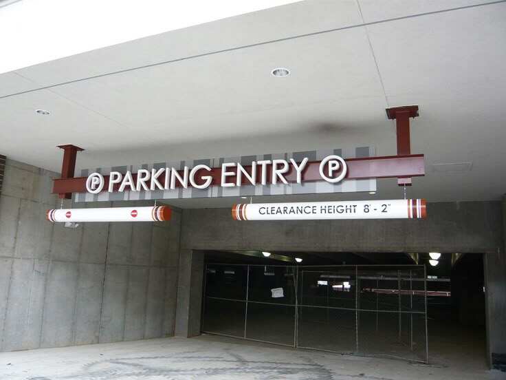
Good interior signs work kind of like quiet traffic cops when placed about 10 to 15 feet ahead of spots where people need to decide which way to go, such as near stairs, at hallway crossings, or around elevator areas. Putting them there gives folks roughly 3 to 5 seconds to read what direction they should take, which helps cut down on those awkward last minute turns or having to backtrack. Studies looking at how people navigate spaces show something interesting too. Signs mounted at eye level, somewhere between 54 inches and 66 inches off the ground, actually help people find their way faster than signs hanging overhead. Research indicates this approach can boost navigation speed by almost a third compared with traditional overhead signage options.
High-impact zones like building entrances, lobby-to-hallway transitions, and food court access points require doubled signage visibility. A staggered approach works best:
Major airports have reduced missed gate connections by 18% using sequential pre-turn signage clusters. A three-stage system guides travelers:
This tiered approach lowered passenger stress levels by 41% in a 2023 aviation facility study.
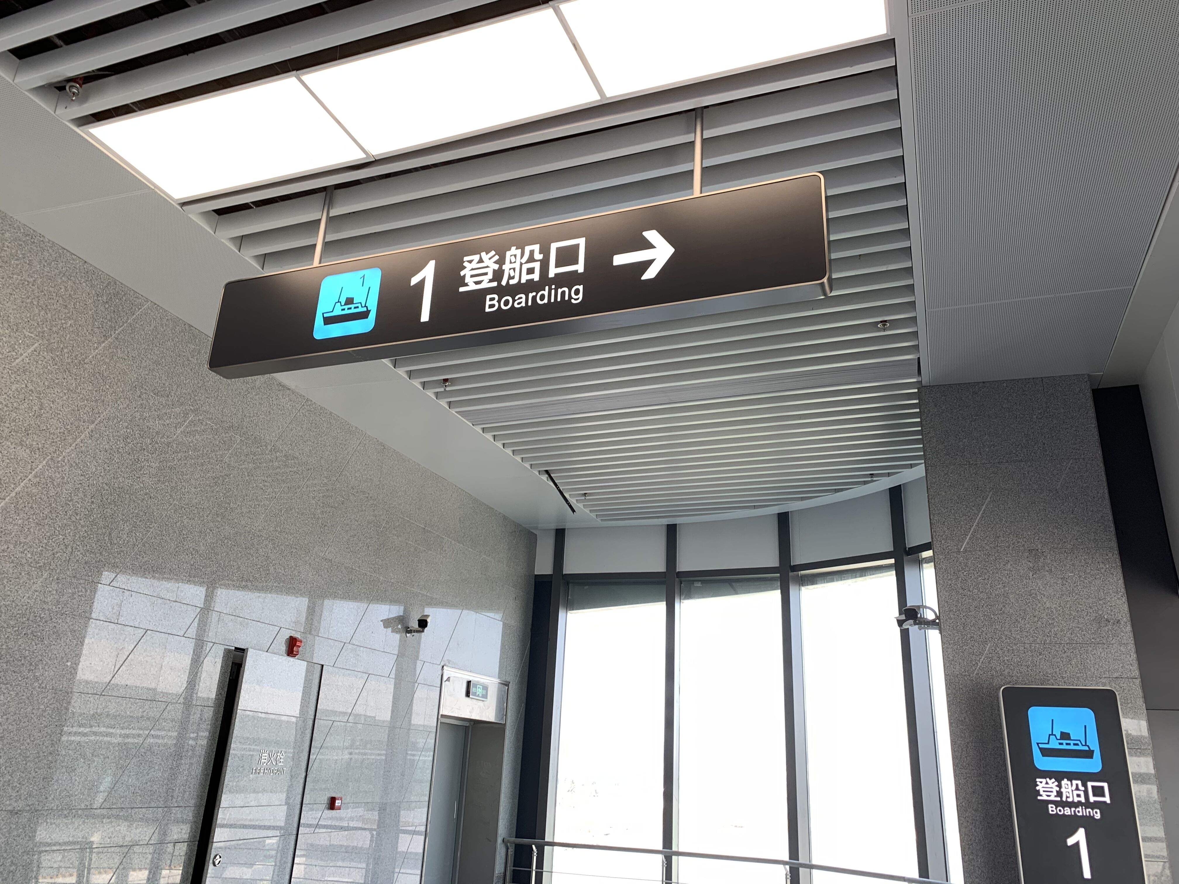
Universal symbols and directional arrows form the backbone of intuitive navigation systems. A 2022 wayfinding study found spaces using standardized pictorial cues reduced visitor hesitation by 37% compared to text-only signage. Research from leading design authorities confirms that arrows positioned at 30-45 degree angles provide the most unambiguous directional guidance.
Strategic color palettes improve wayfinding speed by 28% according to environmental design research (IEDM, 2023). Emergency exit signage using red backgrounds with white text achieves 99% recognition rates versus 76% for monochromatic versions. Maintain visual hierarchy by making primary destinations 40% larger than secondary locations.
ADA-compliant fonts like FS Albert (used in 82% of UK transportation hubs) enable 20/40 vision readability at 5 meters. The SpeedPro design guidelines recommend 70:1 contrast ratios between text and background-crucial for aging populations with reduced visual acuity. Avoid ultra-thin typefaces that disappear under artificial lighting.
A 2023 retail study revealed minimalist signage improved destination recall by 58% compared to cluttered displays. Successful implementations use:
This approach reduces cognitive load while preserving architectural integrity in corporate and hospitality environments.
When businesses maintain consistent visuals throughout their interior signage, it sends a message about professionalism and care for details. Studies indicate that people tend to recommend places with good navigation systems around 2.3 times more often than those without, which definitely affects how they view the brand overall. Keeping fonts, colors, and symbols similar between directory boards in lobbies and other direction markers makes things easier on the brain and helps build stronger brand recognition. This consistency isn't just about looking nice it actually works to guide visitors smoothly through spaces while maintaining that professional appearance companies want to project.
Strategic placement of main directory signs within 15 feet of entryways aligns with natural sightlines, while corridor signage placed at 55"acirc;€“60" height ensures visibility for all users. Breakout directories before major decision points (elevator banks, hallway intersections) prevent backtracking-"a key frustration point for 68% of visitors.
Recent facility management studies reveal that 54% of negative visitor experiences originate from poor wayfinding. High-contrast signage with >40% luminance contrast between text and background improves first-time navigation success rates by 89%.
Forward-thinking facilities now use:
Interior signage plays a crucial role in helping people navigate complex indoor spaces with ease, reducing wrong turns by 62% and lowering anxiety levels by 38%.
Directional signage placed 10 to 15 feet ahead of decision points helps people adjust their paths smoothly, reducing the chance of coming to a complete stop and improving overall foot traffic flow.
Emerging trends include digital interior signage that syncs with building sensors for real-time traffic guidance and personalization through mobile apps.
Consistent signage design builds brand trust and enhances user confidence, leading to a 2.3 times higher recommendation rate. It ensures smooth navigation and a professional image.
Copyright © 2025 by SHENZHEN ZIGO SIGNAGE COMPANY LIMITED Privacy policy

 Hot News